Custom checkboxes, the hard and the easy
A checkbox is one of the common controls built as part of a (custom) UI toolkit. In this post, I'm going to walk you through one of the usual approaches taken by front end developers when dealing with this control, and then I will show you an alternative approach that is much easier and also much better from both DX and UX points of view.
At the end of each section, you will find a link to the working example on CodePen.
Why checkboxes are customized
Let's talk about why checkboxes are customized to begin with.
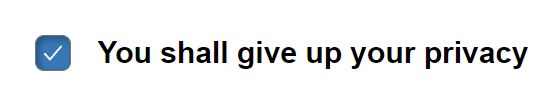
In most browsers, the checkbox is presented as a tiny box with an associated label. For example:
The click target is very small, which is generally bad for most users, but especially users with reduced motor ability. It is also easy to miss when scanning larger forms. Although the label, when properly associated with the input becomes part of the click target, there are users who don't know about this and will still try to click on the box rather than the label. This is especially the case for users who have encountered one poorly coded checkbox too many.
What is big enough, you ask? The minimum click target size should be 44 CSS pixels. We are going to treat this as minimum size at default font size, as we want the checkbox size to scale proportionately with its label. Therefore, this is equal to 2.75em. This is explained in the WCAG success criterion 2.5.5, "Target Size". This is a AAA criterion, meaning that it's not usually considered mandatory, but it's not difficult to achieve, so we are going to apply it in our examples.
Another reason we want to customize the checkbox is to achieve an entirely different presentation, such as a toggle switch.
In this post, we are going to create two variants of the checkbox. A classic checkbox with a larger click target and some transitions, and a toggle switch.
The classic checkbox, the usual hard way
One of the more common ways to implement a custom checkbox is to substitute it for a hidden input, and provide an entirely different set of controls in its stead. Here's one example of this:
<div id="consent-field">
    <x-checkbox data-value="granted">
        <input type="hidden" name="consent" value="">
        <span class="checkbox-box"
              role="checkbox"
              aria-labelledby="consent-label"
              aria-checked="false"
              tabindex="0">
        <svg><use href="#check"/></svg>
        <svg><use href="#indeterminate"/></svg>
      </span>
    </x-checkbox>
    <span id="consent-label" class="checkbox-label">
        You shall give up your privacy
    </span>
</div>
The #consent-field is used to group the label and the checkbox, and
control the layout. This is necessary because the the checkbox is going to
be significantly taller than the label.
I've used the <x-checkbox> custom element to add behavior to the control. It
can have two attributes: data-value and data-indeterminate. The data-value
is a replacement for the checkbox's value attribute, and the other attribute
is used to declare the indeterminate state. Note that the custom element does
not wrap the label, just the form control.
I've used a hidden input to hold the actual value. Empty (or missing)
value attribute on this input is the unchecked state, while presence of
the value is the checked state. This is irrespective of the
data-indeterminate attribute, just like in the native checkbox.
The .checkbox-box element represents the visible checkbox control — the box.
It contains two SVGs that reference a SVG spritesheet not shown in the example.
The reason I use a spritesheet instead of a web font is that web fonts can be
replaced by the user and break the UI. This is common with dyslexic people, for
instance. The two SVGs each represent an icon that is drawn in the box for
the appropriate states.
Since this 'box' is not a real checkbox, I've given it the checkbox ARIA role to
signal to the screen readers that that's what this box is for. I've also
associated it with the label by pointing to the label element using
aria-labelledby. Finally, I'm using the aria-checked attribute to signal
its state.
Finally, the .consent-label represents the label of the form control.
CSS is where the most action happens, so I'll walk you through it bit by bit.
#consent-field {
    display: flex;
    align-items: center;

    gap: 0.1em;
}
The #consent-field wrapper defines the layout of the checkbox-label
combination. I make sure they are vertically aligned, and that there's a tiny
gap between them. I'll get back to this gap later.
x-checkbox {
    flex: none;

    display: inline-flex;
    align-items: center;
    justify-content: center;

    width: 2.75em;
    aspect-ratio: 1;

    cursor: pointer;
    border-radius: 0.4em;
}

x-checkbox:hover {
    background: #efefef;
}
The <x-checkbox> element is styled so that it doesn't expand or shrink within
a flex layout. It defines the outer perimeter of the checkbox — the total
clickable target area — which we said would be 2.75em. To avoid specifying
the same value twice, I use aspect-ratio to make it square. I gave the
element a hover background so that it highlights on hover. It does not
highlight on focus to avoid unnecessary distractions for keyboard-only users.
x-checkbox .checkbox-box {
    flex: none;

    position: relative;

    display: inline-flex;
    align-items: center;
    justify-content: center;

    width: 1.2em;
    aspect-ratio: 1;

    border: 0.062em solid #737373;
    background: #f2f2f2;
    border-radius: 25%;
    box-shadow: inset 0.1em 0.1em 0.2em rgb(0 0 0 / 30%)
}
Since making the checkbox itself 2.75em would result in an ludicrously oversize
checkbox, I have nested .checkbox-box inside <x-checkbox>, and will style
the nested element as the actual checkbox. So the outer area that is 2.75em
squared is the click target, and the inner, smaller box is just the state
indicator and a focus target.
Most of the styling is cosmetic, but I did make sure it has a clearly visible border to make it easier to spot on the page, and I've used a larger 1.2em size to make the target easier to click on for those that feel an urge to be very precise about it. In case you're wondering, 0.062em is about 1px at the default font size. Increasing the default font size will also increase the border width.
x-checkbox svg {
    display: none;

    width: 1em;
    height: 1em;
}

x-checkbox .checkbox-box[aria-checked=true] svg:first-child,
x-checkbox[data-indeterminate] .checkbox-box[aria-checked=false] svg:last-child {
    display: inline-block;
}

x-checkbox .checkbox-box[aria-checked=true],
x-checkbox[data-indeterminate] .checkbox-box[aria-checked=false] {
    background: #3777b3;
    color: white;
}
I've used the aria-checked attribute to set the checkbox icon and background.
And let's take a look at the JavaScript bits. Since a lot of the work is already done by the CSS, we don't need tons of JavaScript. Just a sprinkle here and there.
customElements.define('x-checkbox', class extends HTMLElement {
    connectedCallback() {
        this.setup?.()
        delete this.setup
    }

    setup() {
        let box = this.querySelector('.checkbox-box')

        { // Associate label
            let labelId = this.querySelector('.checkbox-box').getAttribute('aria-labelledby'),
                label = document.getElementById(labelId)

            label?.addEventListener('click', () => {
                box.focus()
                box.click()
            })
        }

        this.addEventListener('click', () => {
            let input = this.querySelector('input')

            // Toggle the input value
            if (input.value) input.value = ''
            else input.value = this.dataset.value
            box.setAttribute('aria-checked', (
                !!input.value ||
                this.hasAttribute('data-indeterminate') &&
                'mixed'
            ))
        })

        this.addEventListener('keydown', ev => {
            if (ev.code == 'Enter') ev.target.click()
        })
    }
})
We start with my standard boilerplate for custom elements:
connectedCallback()
{
    this.setup?.()
    delete this.setup
}
The makes the custom element perform a one-time setup so that it doesn't result in multiple event listener registration in the event the custom element is removed from the document and then added back in. I have explained this in another post.
{ // Associate label
    let labelId = this.querySelector('.checkbox-box').getAttribute('aria-labelledby'),
        label = document.getElementById(labelId)

    label?.addEventListener('click', () => {
        box.focus()
        this.click()
    })
}
Because this is not a real form control and the label isn't real either, I
need to replicate the behavior of the label. I locate the label using the
aria-labelledby attribute, and add the click event listener to it. I want
the checkbox to be both focused and clicked when the label is clicked.
this.addEventListener('click', () => {
    let input = this.querySelector('input')

    // Toggle the input value
    if (input.value) input.value = ''
    else input.value = this.dataset.value
    box.setAttribute('aria-checked', (
        !!input.value ||
        this.hasAttribute('data-indeterminate') &&
        'mixed'
    ))
})
The click handler for the checkbox is attached to the outer container,
<x-checkbox> rather than the inner box. This gives the user the maximum
surface for clicks. The aria-checked attribute has three possible states:
'true', 'false', and 'mixed'. Note that these values are technically string,
but I'm taking advantage of automatic coercion to coerce Boolean values to
strings — true will be set as 'true' and the same for false.
The Boolean expression sets the value to 'true' only if the checkbox is checked,
and otherwise falls back on the presence of the data-indeterminate attribute.
When the attribute is present, the value is 'mixed', otherwise it's 'false'.
Here's a table that shows the relationships between these values:
input.value |
data-indeterminate |
aria-checked |
|---|---|---|
| yes | any | 'true' |
| no | no | 'false' |
| no | yes | 'mixed' |
And the last bit:
this.addEventListener('keydown', ev => {
    if (ev.code == 'Space') this.click()
})
The keydown listener traps the spacebar key and invokes the click handler.
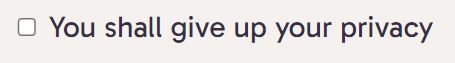
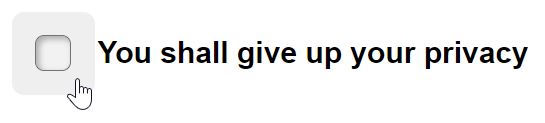
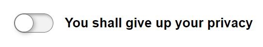
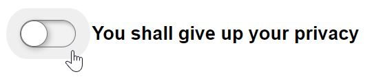
The result looks like this:
When hovering over the checkbox, you can see the hover effect I applied to the checkbox's outer perimeter. That is the total click target area. The small gap I mentioned earlier is there to prevent the text from being right on the edge of the hover area. Makes it look a bit neater.
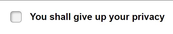
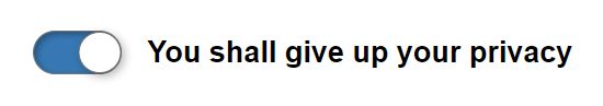
Finally, the checked state.
You can find the code for this in the pen.
The classic checkbox, the easy way
Now let's take a look at the easy way. What I don't like about the usual solution is that they don't leverage the existing behavior of the native checkbox itself. It already does exactly what we need, and we just don't like what it looks like. Can we somehow solve just the looks?
Turns out it's actually rather easy to do. The main reason checkboxes are
somewhat difficult to customize is the default styling cannot be
customized that much. However, it is possible to completely cancel the
default appearance, in which case, the checkbox becomes just like any other
element, like, say, a <span>.
Planning ahead to take advantage of the sibling combinators, I can simplify the markup as follows:
<label id="consent-field">
    <x-checkbox>
        <input type="checkbox" name="consent" value="granted">
        <svg>
            <use href="#check"/>
        </svg>
        <svg>
            <use href="#indeterminate"/>
        </svg>
    </x-checkbox>
    <span id="consent-label" class="checkbox-label">You shall give up your privacy</span>
</label>
Let me walk you through the changes. Most importantly, we are now using a real
checkbox. This has major implications on what we don't have to do. For
instance, we don't have to add any ARIA attributes because the accessibility
technologies have native support for native form controls. It also allows us
to use an actual <label> element as the outer-most element.
What was previously the .checkbox-box is now replaced by the actual checkbox
element. Since we cannot nest anything inside inputs, we are putting our SVG
next to the input. I know I can get to them using the ~ and +
combinators, so that should work.
Moving on to CSS.
#consent-field {
    display: flex;
    align-items: center;
    gap: 0.1em;
}
This portion is identical to the previous example.
x-checkbox {
    flex: none;

    display: inline-flex;
    align-items: center;
    justify-content: center;

    width: 2.75em;
    aspect-ratio: 1;

    cursor: pointer;
    border-radius: 0.4em;
}

x-checkbox:hover {
    background: #efefef;
}
Similar to the previous example, I'm again setting up the outer perimeter for the checkbox which will be used as the click target. Same for the hover state.
x-checkbox input {
    appearance: none;
    display: inline-block;

    position: relative;

    display: inline-flex;
    align-items: center;
    justify-content: center;

    width: 1.2em;
    aspect-ratio: 1;

    border: 0.062em solid #737373;
    background: #f2f2f2;
    border-radius: 25%;
    box-shadow: inset 0.1em 0.1em 0.2em rgb(0 0 0 / 30%);

    font: inherit;
}
I used appearnce: none to reset the default appearance of the checkbox.
The rest of the code is exactly the same as in the previous example.
The font: inherit rule resets the font properties. By default the form
controls don't use the default font size of the document, so it's a good idea to
reset those to keep things consistent, especially if you use rem/em units (as
you should).
x-checkbox svg {
  display: none;

  position: absolute;
  margin-left: 0.062em;
  margin-top: 0.062em;

  width: 1em;
  height: 1em;
}

x-checkbox :checked + svg,
x-checkbox :indeterminate ~ svg:last-child {
  display: inline-block;
}

x-checkbox :is(:checked, :indeterminate) {
  background: #3777b3;
}

x-checkbox :is(:checked, :indeterminate) ~ svg {
  color: #fff;
}
I get a bit of simplification in the selector thanks to the checkbox having a
pre-defined set of pseudo-classes for its state. Hopefully I don't need to
explain these selectors. I'll briefly touch on the sibling combinators, though.
The next sibling combinator, + can target the immediately following sibling
only. So I use this to target the first SVG, which is the check mark. The
subsequent sibling combinator, ~, targets all subsequent siblings that match
the query. Therefore, I have to additionally qualify the SVG element as being
:last-child, otherwise it also catches the other one.
Finally, let me show you the JavaScript:
Yes, it's empty. Since the checkbox is already doing everything I need, there's no need to add any JavaScript. I use the custom element as simply a namespace for the CSS selectors.
The results are identical in terms of appearance, so I won't repeat the screenshots.
You can find the code in the pen.
The toggle button, the usual hard way
Once we have the working checkbox implementation, turning it into a toggle
button is rather straightforward. First I empty the contents of the
.checkbox-box, as I no longer need to show any icons.
<x-checkbox data-value="granted">
    <input type="hidden" name="consent" value="">
    <span class="checkbox-box" role="checkbox" aria-labelledby="consent-label"
          aria-checked="false" tabindex="0">
    </span>
</x-checkbox>
Next, I will adjust the styling to produce the toggle button:
x-checkbox {
    /* existing code .... */

    /*
    width: 2.75em;
    aspect-ratio: 1;
    */
    height: 2.75em;
    padding: 0 0.625em;

    /* existing code .... */
}
Since toggle button is not square, I don't need the aspect-ratio property
anymore. And instead of the width, I will set the height. Because there's
still the hover background, I will add paddings on either side. The 0.75em
padding is derived from the intended height of the visible part of the button,
which is going to be 1.5em. This should create a nice even hover background
around the inner element.
x-checkbox .checkbox-box {
    /* existing code .... */

    /*
    display: inline-flex;
    align-items: center;
    justify-content: center;

    width: 1.2em;
    aspect-ratio: 1;
    */
    height: 1.5em;
    aspect-ratio: 2;

    /* existing code .... */

    /*
    border-radius: 25%;
    */
    border-radius: 50% / 1.5em;

    /* existing code .... */
}
I no longer need the checkbox to be a flexbox, so I'll remove that. The checkbox's inner box looks mostly like it should except for the shape and size. Therefore I change the size to be 1.5em and set the aspect ratio to 2. The reason I use 2 is it makes it a bit easier to calculate the position of the toggle tab. Not a huge difference but it's a bit more convenient.
x-checkbox .checkbox-box::before {
    content: '';
    display: inline-block;

    height: 100%;
    aspect-ratio: 1;

    background: #fff;
    border-radius: 50%;
    border: 0.062em solid #737373;
    box-shadow: 0.1em 0.1em 0.3em rgba(0 0 0 / 30%);

    transition: transform 0.2s;
}

x-checkbox .checkbox-box[aria-checked=true]::before {
    transform: translateX(100%);
}
For the toggle button tab, I'm using the ::before pseudo-element. I give it a
pure white background to stand out from the box. The box shadow is made stronger
so that it looks like the tab is sticking out.
The position of the tab is controlled by the aria-checked attribute.
Lastly, we change the background color when the
As far as JavaScript go, it's pretty much the same except that I removed the support for indeterminate state, as it makes no sense for toggle buttons.
box.setAttribute('aria-checked', !!input.value)Let me show you what it looks like. First the default state:
The hover effect produces a similar effect as before. It's just following the shape of the visible part of the button.
When the button toggles on, the background color is changed. This is the same as with the original checkbox:
It is also possible to create a single stylesheet and a single custom element that supports both these styles. However, I think it was worthwhile to demonstrate the process of modifying the code to see how much of what I needed to change when the concerns are properly separated.
Again, here's the code in a pen.
Toggle button, the easy way
Technically, modifying the classic checkbox that is based on the input element is not any easier (or harder) than modifying the one that is not based on an input. We are doing more or less the same thing.
We adjust the dimensions of the <x-checkbox> and the <input> elements,
remove the SVG, and that's pretty much it. The only difference here is that we
don't need to touch any JavaScript because there is none.
You will find the working example in a pen.
Conclusions
The main take-away in this post is that basing your solution on the wrong starting point results in more code and more work. Moreover, you could always forget something. For instance, the solutions based around a hidden input with entirely custom form controls loses the feature where you submit the form by pressing Enter/Return while the control is focused. There's also no easy way to add constraint validation. And so on and so forth. In other words, you would be doing more work to get less features. Not worth it.
As a rule of thumb, you always want to start with something that's close to what you need in terms of behavior.
In all of these cases, I've used CSS selectors to implement the crucial parts of the UI. This is one of those cases where doing CSS before JavaScript makes a lot more sense. You generally want to get to a state where you can manually toggle attributes and get the desired visual feedback before you proceed to 'automate' that using custom elements, jQuery or some other method. CSS's reactive nature does away with a lot of wiring in your JavaScript code.