No constraints with constraints validation
I don't really think frameworks are necessary, true. But it's also true that most projects today use them, and you can't just scrap legacy code. But damn, at least scrap that complicated mess of form-handling libraries, for crying out loud!
Forms are not supposed to be quantum surgery. Some custom controls can be tricky. Organizing controls into complex workflows can be somewhat tricky. But handling forms themselves is stupid easy. Even with React (and similar frameworks).
In this post, I want to cover integrating constraint validation into forms. This does not require any library, and, as you will see, in most cases it's dead easy. It does, however require you to know how constraint validation works. For that, I will refer you to the MDN article on constraint validation. Here I will focus on just the React-specific bits.
The techniques I'm about to describe work in most major frameworks except Angular. In Angular, you will have to jump through hoops to get this to work, and the effort required is, in my opinion, not worth it. It's a darn shame, if you as me.
This time I have two pens for you, with two different implementations. Both are described in this post, but if you're in a hurry, here's the version without custom elements and the version with custom elements.
The scenario
We're going to do a typical registration form. The minimal version with just a username, an email, and a password. The password field is going to have a matching confirmation field where you will retype the password. We are expected to submit the data to the server in JSON format and only supply the first three fields. Server does not care about the password confirmation. It's a strictly client-side field.
We're going to split the task into three parts:
- Validation
- Error message presentation
- Additional behavior for better usability
We are going to use the following validation constraints (rules):
- The username field is required, minimum 4 characters long and 20 characters at most, and cannot be any of the following: admin, root, moderator, or user.
- The email field is required and must be a valid email.
- The password field is required, must be at least 8 characters long, and must contain a lower-case, upper-case, number, and one special character (where special character is anything that isn't one of the previous 3 groups or whitespace).
- The password confirmation field is required and must match the password field.
Basic setup
Let's start with a basic form.
function RegistrationForm() {
    return (
        <>
            <h1>Register</h1>

            <form>
                <Field
                    label="Username"
                    type="text"
                    name="username"
                />
                <Field
                    label="Email"
                    type="email"
                    name="email"
                />
                <Field
                    label="Password"
                    type="password"
                    name="password"
                />
                <Field
                    label="Retype password"
                    type="password"
                />
                <button>Register</button>
            </form>
        </>
    )
}

function Field({label, ...props}) {
    return (
        <div className="field">
            <label>
                <span>{label}</span>
                <input {...props}/>
            </label>
        </div>
    )
}
The Field component handles the basic layout of the individual fields in the
form.
You will notice that the "Retype password" field does not have a name
attribute. This is intentional. Since we do not intend to submit the field, we
don't really need the name for it.
Validation functions
For validation, we will use a mix of built-in and custom constraint validation.
For every mandatory field (all of them, basically), we will use the required
attribute. The email field is validated based on its type attribute, so we
don't need to do anything else. The username, password, and password
confirmation fields will need custom validation functions.
Validation functions should stick to validating things that are not validated by
other validators. They do not need to validate if a required field is populated
as that is already done by the required constraint. Therefore, each validator
will eliminate this case first — as far as these custom validators are
concerned, empty field is a valid field, as there was nothing to validate.
Errors in constraint validation are strings. Therefore, a validator function either returns an empty string if everything is valid, or an error message if there is an error.
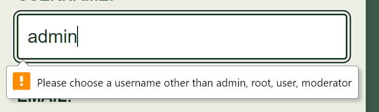
I will deal with the username first. To validate the username, I need a list of restricted usernames.
var RESTRICTED_USERNAMES = ['admin', 'root', 'user', 'moderator']The validation function looks like this:
function validateUsername(value) {
    if (!value) return ''
    if (!RESTRICTED_USERNAMES.includes(value.toLowerCase())) return ''
    return 'Please choose a username other than ' + RESTRICTED_USERNAMES.join(', ')
}
For passwords, we are requiring various classes of characters to be included. These are uppercase and lowercase letters, digits, and symbols.
We want the error message to be informative. Therefore, I am going to enumerate all missing character classes first, and then create the error message after the fact, instead of returning on the first missing character class.
function validatePassword(value) {
    if (!value) return ''

    var missingClasses = []
    if (!value.match(/\p{Ll}/u))
        missingClasses.push('lowercase letter')
    if (!value.match(/\p{Lu}/u))
        missingClasses.push('uppercase letter')
    if (!value.match(/\p{Nd}/u))
        missingClasses.push('digit')
    if (!value.match(/[^\s\p{L}\p{N}]/u))
        missingClasses.push('symbol')

    if (!missingClasses.length) return ''

    if (missingClasses.length == 1) return 'Please include at least one ' + missingClasses[0]
    return 'Please include at least one of each: ' + missingClasses.join(', ')
}
I used the \p character class in order to allow a full range of unicode
characters, not just the Latin alphabets.
For password confirmation, we do a simple comparison with the password field. Because of this, we need to let the validation function also take values from other fields.
function validatePasswordConfirmation(value, otherValues) {
    if (!value) return ''
    if (value == otherValues.password) return ''
    return 'Your passwords did not match. Please retype it correctly.'
}
Adding validation to fields
There are multiple ways to add the validation to the fields, but it all boils
down to this: we need to call setCustomValidity() on the element, and pass it
either an empty string or an error message.
The dumbest thing that could possibly work in this case is to just do it in
the Field component. I will add a validator prop so that I can pass a
validator to the field. One validator also needs a form, and you might think
that performing validation in the form component might make more sense, but
we are going to have access to the form from every form control connected to
it, so we should have everything we need as long as we can access an input.
To get the data from the form, I will implement a small utility function. This technically is a premature optimization (I could have also done it inline), but I know that I will need the exact same thing later when handling form submission.
function formToData(form) {
    return Object.fromEntries(new FormData(form))
}
I want the custom error message to update every time the input value changes.
The interesting thing about how constraint validation works is that display of
the error message is completely separate from the validation itself. Calling
setCustomValidity() does not display the message right away. We will concern
ourselves with the display and timing later, and focus on applying the custom
validation functions.
function Field({label, validate, ...props}) {
    props.onChange = function (ev) {
        if (validate) {
            var message = validate(
                ev.target.value,
                formToData(ev.target.form),
            )
            ev.target.setCustomValidity(message)
        }
    }

    return // ...
}
Now we can add the custom validators as well other constraints:
 <Field
   label="Username"
   type="text"
   name="username"
   validate={validateUsername}
   required
   minlength="4"
   maxlength="20"
 />
 <Field
   label="Email"
   type="email"
   name="email"
   required
 />
 <Field
   label="Password"
   type="password"
   name="password"
   validate={validatePassword}
   minlength="8"
   required
 />
 <Field
   label="Retype password"
   type="password"
   validate={validatePasswordConfirmation}
   required
 />
Our form is now fully equipped to perform validation. We can test if the validation works, and the messages are going to be presented using the default message popup when we try to submit it.
If you're happy with the results, you can just skip to form submission.
Custom message styling
The problem with the default validation error message is some people just don't like how they look.
By default, the error messages are shown in a popup. They appear on the first
field that failed the constraint validation. The field is also focused. When the
form submission is attempted, the 'invalid' event is first triggered on every
field that fails its constraints. We are given an opportunity to prevent the
default behavior in the listener.
Before I do this, I will note a few things that preventing the default will break:
- The error message is not going to be associated with the field, so we need
to manually associate it using
aria-describedby. - Since associating fields with other elements using ARIA attributes requires a unique id for the associated element, so we need to figure out a way to generate such ids ad-hoc.
- The field will not be marked as invalid for the screen readers, so we need
to manually mark it as invalid using
aria-invalid. - The first field with an error will not be focused automatically, so we need to restore this behavior.
- We additionally need some way of re-rendering components that want to show error messages.
- The error messages are going to be shown for all invalid fields at once rather than just the first one. This is fine.
- Once the error message is shown, we need to continue showing the message on every edit.
As you can see, not being "happy" with something that comes for free sometimes ends up being quite expensive. We'll do it nevertheless because we know they'll ask us to do it later anyway. 😂
I'll first take care of the unique id. We will keep track of the id using a simple variable that holds a number. Every time we use the number, we'll increment it.
var nextId = 1To apply the id, we will use the memo hook. While we're at it, we'll also
add the state that represents the error message and the separate bit of
state that represents our intent to display the message.
function Field({label, validate, ...props}) {
    var [error, setError] = useState('')
    var [showError, setShowError] = useState(false)
    var id = useMemo(function () {
        return `field-${nextId++}`
    }, [])

    // ...

    return (
        <div className="field">
            <label>
                <span>{label}</span>
                <input {...props}/>
            </label>
            <p id={`${id}-error`} className="error" hidden={!showError}>
                {error}
            </p>
        </div>
    )
}
Rather than conditionally rendering the error message, we will simply hide it when the error message is not present.
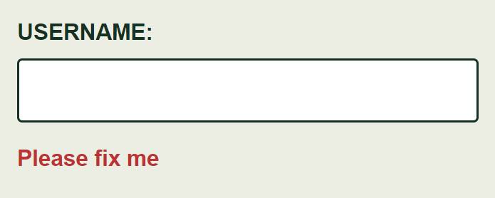
We've set everything up for the error messages, so now we can give it a quick spin to test if it works. To do this, I'm just going to temporarily rig the default state to force it to show me the message.
var [error, setError] = useState('Please fix me')
var [showError, setShowError] = useState(true)
The result looks promising:
Next I can revert the initial state to the defaults and rig the input so that it
will show the custom error message. To do this, I need to modify the onChange
event listener to update the error state continuously, and also add a new
'invalid' event listener to set the showError state.
function Field({label, validate, ...props}) {
    var [error, setError] = useState('')
    var id = useMemo(function () {
        return `field-${nextId++}`
    }, [])

    props.onInvalid = function (ev) {
        ev.preventDefault()
        setShowError(true)
        setError(ev.target.validationMessage)
    }

    props.onChange = function (ev) {
        // ...
        setError(ev.target.validationMessage)
    }

    // ...
}
As we said before, I need to prevent the default behavior to suppress the popup
(and other useful bits). The inputs have a validationMessage property that
contains either an empty string or an error message. The setError() is called
in both event listeners. This is because if the user never touches the fields,
we still need to show the message.
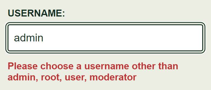
Hitting submit now shows the custom error messages for all fields at once as expected.
Error message accessibility
So far so good, but the message is not yet formally associated with the field. It is only rendered near the field, so it's obvious to the visually able users, but screen readers don't know about the relationship. I'll take care of that now.
function Field({label, validate, ...props}) {
// ...
if (showError && error) {
props['aria-invalid'] = true
props['aria-describedby'] = `${id}-error`
}
// ...
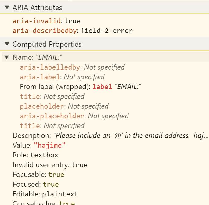
}Testing with a screen reader confirms that the field is indeed read out as invalid when it has an error message.
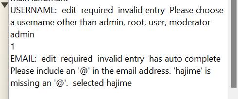
I can also verify this information by looking at the Accessibility pane in the Chrome developer tools.
Invalid field behavior
As I mentioned before, we are going to need to restore the "jump to first field with error" functionality. This is very useful in long forms where the invalid fields are outside the viewport. When clicking "submit", we don't want the user to be left wondering why it failed. This also applies to screen reader users, who aren't necessarily able to "quickly scroll to the top" to scan the form.
To implement this, I will need to modify the 'invalid' event listener. There I
will need to locate the first form with an error and focus it.
Since the 'invalid' event fires for every field in the form, we can't simply
call .focus() on the event target. That would end up focusing the last field
that received the event — the last invalid field in the form. What I can do
instead is I can focus the first invalid field from every 'invalid' event
listener, so it technically doesn't matter which one fires last.
function Field({label, validate, ...props}) {
    // ...

    props.onInvalid = function (ev) {
        // ...
        setTimeout(function () {
            ev.target.form.querySelector('input:invalid')?.focus()
        })
    }

    // ...
}
The :invalid pseudo-class applies to any element with a validation error. I've
grabbed hold of the form element using the event target, and I queried for the
first :invalid input, and focused it. I used optional chaining so that it only
calls .focus() if an invalid field exists.
The reason this is wrapped in setTimeout() is that, in my case, the CSS makes
the layout shift a bit and there is a need to prevent the autocomplete options
appearing in a seemingly random position in Chrome.
Form submission
Form submission is actually a piece of cake. I've already implemented the
formToData() function so all I need is to use it in the 'submit' event
listener.
function RegistrationForm() {
    function handleSubmit(ev) {
        ev.preventDefault()
        var data = formToData(ev.target)
        console.log(data)
    }

    return (
        <form onSubmit={handleSubmit}>
            // ...
        </form>
    )
}
Note one thing at this stage. Although the submission listener is set up now,
the form will not actually receive the 'submit' event as long as there are
invalid inputs. This is a built-in feature, and it means that we don't have to
worry about validation in the submission listener. If the listener got
triggered, we are guaranteed that the inputs are valid — to the extent we did
our validation correctly.
Also remember to add the submission listener to the <form> element, not the
button. Clicking the submit button is only one way to submit forms. You can also
press the Enter key in any of the fields, and mobile browsers will provide a
button for it. Your best bet is to add the listener to the form.
Getting rid of state
We're done with our form, but we can do better — or at least more efficiently.
I say 'get rid of state', but really, we want to get rid of re-renders and since in React it's the state that drives renders, getting rid of state basically gets rid of re-renders associated with that state.
Currently, the Field component is re-rendered every time its state changes,
which is pretty much on every edit. We can get rid of this re-rendering by
moving the error-related logic to a custom element.
When passing data between React and custom elements, we have two common approaches. One is to set an attribute. Another is to call a method on the custom element or set its property. The first option is great for anything that can be represented as a string, as long as the conversion to and from the string is not too expensive (e.g., sucks for large JSON payloads). The second options involves using refs and effect hooks — more boilerplate — but can pass any JavaScript value to the custom element. In our case, the custom element will need the validator function, so I'll got with the second approach.
I'm going to modify the Field component first.
function Field({label, validate, ...props}) {
    return (
        <x-field>
            <label>
                <span>{label}</span>
                <input {...props}/>
            </label>
            <p className="error"></p>
        </x-field>
    )
}
I've removed all state hooks, and event handlers. That's all going to move to
the custom element. I've replaced the <div className="field"> with
<x-field>. I don't really need the class since the tag name is unique enough.
I just need to fix the CSS later.
I've also gotten rid of the id and hidden attributes from the
<p className="error"> element, and the unique id is no longer calculated in
the component either. All attributes on this element, as well as its contents,
will be managed by the custom element.
Next I will create the basic skeleton for the x-field.
customElements.define('x-field', class extends HTMLElement {
    connectedCallback() {}
})
I usually start with a blank connectedCallback() hook. (As a side note, I like
to collapse the curlies for methods that I plant to implement later as a note to
myself. When I see curlies on the same line, I know I need to do something about
it.)
If you're new to custom elements, I will point out that that it is implemented
as a subclass of the HTMLElement. This means that this within the methods of
this class points to the custom element itself. It has all the properties and
methods you would normally find on a generic DOM element. Keep this in mind
while reading the rest of the code.
The first thing I will implement is the unique id. Since I'm working with a
class, I think it would be neater if the variable that tracks the next id
lived on the class itself.
customElements.define('x-field', class extends HTMLElement {
    static nextId = 1

    connectedCallback() {}
})
Usually the first think I need to do is set up the initial state of the
elements. I will first grab the reference to the error message element and then
add the id to it. I'll also set its hidden attribute to true. The reason
I'm not doing this in React is it's generally a bad idea to manage the same
attribute in both React and the custom element, and I will need to flip this
attribute later in the custom element.
customElements.define('x-field', class extends HTMLElement {
    static nextId = 1

    connectedCallback() {
        var id = `field-${this.constructor.nextId++}`
        var $errorMessage = this.querySelector('.error')

        $errorMessage.id = `${id}-error`
        $errorMessage.hidden = true
    }
})
Next I will set the validator property on the <x-field> element in an
effect hook:
function Field({label, validate, ...props}) {
    var fieldNode = useRef()

    useEffect(function () {
        fieldNode.current.validator = validate
    }, [validate])

    return (
        <x-field ref={fieldNode}>
            // ...
        </x-field>
    )
}
Now I can implement the validation logic.
customElements.define('x-field', class extends HTMLElement {
    // ...

    connectedCallback() {
        var xField = this
        var $input = this.querySelector('input')
        // ...

        $input.addEventListener('input', function () {
            if (xField.validator) {
                var formData = formToData($input.form)
                $input.setCustomValidity(xField.validator($input.value, formData))
            }
        })
    }
})
Last time we also implemented logic to set the message. For this part, I will
need to take off my declarative hat, and put on the imperative hat. I'll
implement setting of the error message as a separate function, because I already
know I will also need this functionality in the 'invalid' event handlers.
customElements.define('x-field', class extends HTMLElement {
    // ...

    connectedCallback() {
        // ...

        function updateErrorMessage() {
            if ($errorMesage.hidden) return

            $errorMessage.textContent = $input.validationMessage

            if ($input.validity.valid) {
                $input.removeAttribute('aria-invalid')
                $input.removeAttribute('aria-describedby')
            }
            else {
                $input.setAttribute('aria-invalid', true)
                $input.setAttribute('aria-describedby', $errorMessage.id)
            }
        }
    }
})
For efficiency sake, we will not set the message as long as the error message
element is hidden since there's no point in updating something that won't be
used. When the element is visible, we set the actual message text. We also
update the aria-invalid and aria-describedby attributes based on whether the
input is valid or not.
Now I can add this to the 'input' event handler, and also implement the
'invalid' event handler:
customElements.define('x-field', class extends HTMLElement {
    // ...

    connectedCallback() {
        // ...

        $input.addEventListener('input', function () {
            // ...
            updateErrorMessage()
        })

        $input.addEventListener('invalid', function (ev) {
            ev.preventDefault()
            $errorMessage.hidden = false
            updateErrorMessage()
            setTimeout(function () {
                $input.form.querySelector('input:invalid')?.focus()
            })
        })

        // ...
    }
})
We now have a completely re-render-free version of the app.
Conclusions
Here's a list of take-aways from this demo:
- You don't need controlled components for handling forms. At all. Have you noticed?
- Constraint validation is, indeed, quite flexible. You can customize not only the validation logic but also the presentation of the error messages and more.
- On the other hand, customizing messages requires a lot more work compared to just using the default presentation.
- We can use custom elements to get rid of at least some state, and reduce re-renders.