Can you build a robust fool-proof responsive layout?
Why, yes you can! And it's much easier than you (probably) think.
Breakpoint - point where things break
Most developers think of "breakpoints" as display size. I've talked about this in great length in one of my earlier articles, so I recommend reading There's no such thing as a desktop screen if you want a long version. In this post, I'm going to focus exclusively on media queries.
Let's switch things up a little. Think of breakpoints as "points as things break". What do I mean by this?
As you change your screen size gradually (e.g., by resizing the browser window), some things start to fall apart. The point where certain parts of the page start breaking is the breakpoint.
Responsive breakpoints
Most of you are familiar with the concepts of using breakpoints to create responsive layouts, but did you know that breakpoints themselves can be responsive? Yes, that's right.
Breakpoints are not made responsive to viewport widths, though. They are made responsive to font sizes.
The text is (still) the major vehicle for information on the web. Controls have text labels, most of the content is text, and text layout plays an important role in not just establishing the tone and style of the page, but also in readability. Relying on pixel dimensions and disregarding the integrity of text layouts leads to results such as this one:

The layout is broken because both the dimension of the elements and the media
query are based on pixels, while the font sizes are in rem. As a general rule
of thumb, you either do everything in pixels, or you do nothing in pixels. If
you don't do this, your layout becomes mangled like a dry carrot the moment
someone decides to change the default font size of the browser — pretty much
everything that contains text will break in unpredictable ways.
My recommendation is that you should categorically avoid using pixels for
anything. There is no need to use them anywhere. Use any kind of relative units
(rem, em, ch, %, vw, etc.).
If you want my personal recommendation on what units to use try:
em- for most things including paddings, margins, width/height, border width and radius...%- for font sizes and some widths/heightsrem- when you know you need itvwandvh- when you know you need them- no unit - for any property with 0 value and
line-height
Since we say we don't use pixels anywhere, the same applies to media queries.
In other words, I also recommend using em (or rem) for breakpoints. When it
comes to media queries, em and rem don't make any difference. I use em
because it's one character less, and I use it for everything anyway, so...
habit.
The reason you want to use em/rem breakpoints is that the breakpoint itself scales with the base font size of the page (default setting in the browser). This makes the breakpoints truly responsive — robust against failures due to font size changes.
The idea is quite simple. You make the browser text larger, all elements on the page become larger (because you're using text-relative sizes), so they take up more space. If you use fixed absolute values of breakpoints, they would no longer be able to accommodate the larger elements. On the other hand, if the breakpoints are also text-relative, they grow with the increase in font size as well, so nothing breaks.
Why not zoom?
Some people think "Why does anyone increase font sizes when they can simply zoom in?" Yes, that's also an option. However, that's not the right question to ask as a developer.
Developers cannot (and probably should not) make recommendations for the end user. How users user their browser is their business. Our business is to make sure that our page doesn't fall apart however the user happens to be using their browser — within reason. Besides, accounting for differences in default font sized isn't that difficult anyway.
Incidentally, I also change the default font size in my browsers. The primary reason I do this is it's easier than zooming in on every site separately. The downside is, of course, many sites are not as well-made as they could be, so some of them (most) break in one way or another.
How to create responsive layouts
To create responsive layouts, first start with the normal layout at the screen size at which you typically work (for me that's half the screen on a 4k display with display scaling enabled. Since we are talking about responsive layouts, the exact dimensions of the screen and how you lay your window out doesn't — well, shouldn't — matter at all, so use whatever you prefer.
When you are mostly done with the layout, open the developer tools, and turn on the responsive mode (on Chrome it is called device mode, on Firefox they call it responsive design mode). You want to configure the responsive mode such that you can freely change the viewport size.
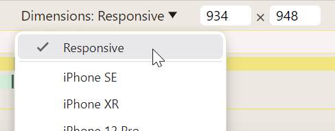
On Chrome this is achieved by setting the dimension to "Responsive" in the device toolbar:
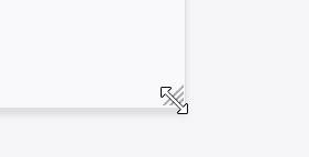
On Firefox, we simply grab the drag handle at the bottom-right corner of the screen and it automatically switches to the "Responsive" mode:
Now, set the width of the viewport to about the size you used when you worked on the page (you may need to zoom out a bit to get there). Slowly reduce the width until something breaks. Go back a little until it is fixed. This is your breakpoint. To calculate the width of the breakpoint, divide the pixel width of the viewport by the default font size of the browser. If you're not sure what that is, it's 16 if you haven't messed with the setting. If you changed the setting, then you can get it quickly in the dev tools by running the following piece of JavaScript:
parseFloat(getComputedStyle(document.documentElement).fontSize)You can even quickly calculate the rem size of the viewport in the dev tools:
window.innerWidth / parseFloat(getComputedStyle(document.documentElement).fontSize)Bookmarklets
I have created a bookmarklet that lets you get the viewport width in rem by
clicking a bookmark in the bookmark toolbar. To add it to your bookmarks, simply
drag the following link there:
Here's another bookmarklet that converts any pixel dimension to rem: