Custom confirmation code input
Build a custom form control for entering OTP and confirmation codes
The way of kata
Kata is an exercise for muscle memory. It's not intended to fill your brain with information but train your fingers to react. The information is there to give you the why, but your fingers need to learn the how.
The material on this page is presented in a specific order — from least specific to highly technical. You will learn the most by jumping in as soon as you have some idea of what you should do. Once you're done, read the rest of the material and check your solution.
All katas are designed to be doable without using 3rd party libraries (and, in fact, the point is to also learn how to do what these libraries do).
To make the best of katas, observe the following rules.
- Don't rush.
- When stuck, take a break and do something unrelated.
- Do not copy/paste code. Always retype everything.
- Do not use AI tools to generate code.
- Try to do something that wasn't in the instructions, experiment.
- Repeat the kata from time to time, even if you think you've got it.
- You have mastered the kata once you are able to complete it without thinking too much.
Remember, the goal is not to get it done, but to get some practice.
Introduction
In this exercise you will build a custom form control for entering OTP and confirmation code.
Skills you will acquire
- Building a custom form control
- Connecting custom elements to forms
- Advanced constraints validation
- Handling pasting
- Managing input focus
Objective
- Build a custom control that consists of 6 inputs
- The inputs take one character each
- Control the validation of the individual inputs using standard constraints validation
- Prevent submission of the form when the inputs are invalid and show the error message
- Allow all 6 inputs to be populated using the paste clipboard action
- Allow seamless typing between inputs
Check your solution
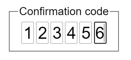
- The OTP/confirmation code input is shown as a group of 6 blank inputs
- When you focus any of hte inputs, the screen reader will announce the label for the entire group (e.g. "Confirmation code")
- As the inputs receive focus, the screen reader will announce the individual input's purpose (e.g., "1st digit", "5th digit", "last digit")
- When you type in the input, each character moves focus to the next field
- Using the Backspace key to erase the character will seamlessly work across fields
- It is possible to paste text into any of the inputs, and the text will populate the characters starting with the first input until either the end of the pasted text or the last input, whichever comes first
- The input validation message is shown on the last input when the inputs fail to validate
- It is impossible to submit the form when inputs are not filled in or the input value is invalid
Materials
Keep in mind
The big picture is that you are building a single form control that consists of multiple inputs under the hood.
You should be able to do this without creating a single element in JavaScript. As much as you can, try sticking to this ideal. Set the HTML up so that JavaScript can focus on behavior.
The individual inputs each need to have their own label. Additionally, all
inputs are grouped using a <fieldset> element. When using the <fieldset>,
you need to have a <legend> element inside it that says what the group
represents. In this case, the group itself represents the confirmation code,
while individual inputs represent digits.
The label text for the individual inputs can be visually hidden as the purpose of the inputs should be immediately visually obvious.
Since you don't want the form to submit until the inputs validate, you want the custom control to participate in the form. For this to work, we need several things:
- Custom element that represents the control
- A
static formAssociated = trueproperty on the custom element class - Attached element internals
With these three conditions satisfied, the custom element gains the ability to participate in the constraint validation system of the form.
You ideally want to set up your input markup (in HTML) so that:
- The number of inputs can be adjusted in the HTML without breaking the custom element (don't assume 6 inputs).
- What constitutes a valid input should be defined on each input using the
standard constraint validation attributes such as
pattern. This means that you can define all inputs to be digits, or individually define inputs to be something else (e.g., digit, then letter, then digit, etc). - The input should be limited to a single character by using the
maxlengthattribute.
When you type a single character into an input, the focus should automatically move to the next input. This allows the user to simply type the code as if all inputs are just one input. The Backspace key should work the same way: it should clear the previous input.
There is an interesting phenomenon that you can use to your advantage when
implementing the Backspace key behavior. If you start handling the keyboard
event using the keydown event (instead of keyup or keypress), changing
focus of an input has an interesting effect of applying the key event to the
input that received the focus last rather than the input where the key event
started.
To handle pasting the code into the input, you can handle the paste event on
any input (it bubbles so you can also add a delegated event listener on the
custom element itself). When pasting the text, you want to fill the inputs
one by one using the characters in the pasted text. If the text is shorter
than the number of inputs, then simply stop after the last character. After
the inputs are populated, you will want to focus the input after the last
populated input or the last input if it was the one populated last.
The value of the custom control is a string that combines the characters from
all the inputs. On custom elements with attached internals, you can use the
ElementInternals.setFormValue() method to set the value. Note that the if
there are any skipped inputs in the control, they should count as a space
character.
When setting the value on the element internals, you should also validate the
field and set the validation status. To do that, use the
ElementInternals.setValidity() method. Remember that you also need to clear
validity when validation passes. To validate the inputs, you will iterate
through the inputs and check each one's validity. If there is at least one
invalid input, then the whole custom control is invalid. The validation message
should be shown the same way it is shown when using the constraint validation on
any input. Since the custom control consists of 6 separate inputs, you will need
to decide which one should be used to display the message (consult the
documentation for the setValidity() method about how to select the input that
will display the error message). Since correcting the input means deleting the
existing values, pick the input that makes this easy for the end user.
When deciding on the message to use, follow the following guidelines:
- Use simple words - don't complicate, don't use jargon
- Make it concise — tell it in the shortest form possible
- Make it actionable — tell the user what to do next
To test your design, try the following:
- Increase or decrease the number of inputs in the HTML and test that the control still works
- Try to change the control so that it supports hexadecimal digits (numbers 0 through 0 and letters A through F)
Reading list
- Visual hiding
- Testing with NVDA screen reader (Windows)
- Using VoiceOver to evaluate web accessibility (Mac)
- Using custom elements (MDN)
HTMLElement.attachInternals()(MDN)- Constraints validation (MDN)
pasteevent (MDN)CliboardEvent.cliboardData(MDN)ElementInternals.setFormValue()(MDN)ElementInternals.setValidity()(MDN)