Skin a checkbox
Customize the look and feel of a checkbox
The way of kata
Kata is an exercise for muscle memory. It's not intended to fill your brain with information but train your fingers to react. The information is there to give you the why, but your fingers need to learn the how.
The material on this page is presented in a specific order — from least specific to highly technical. You will learn the most by jumping in as soon as you have some idea of what you should do. Once you're done, read the rest of the material and check your solution.
All katas are designed to be doable without using 3rd party libraries (and, in fact, the point is to also learn how to do what these libraries do).
To make the best of katas, observe the following rules.
- Don't rush.
- When stuck, take a break and do something unrelated.
- Do not copy/paste code. Always retype everything.
- Do not use AI tools to generate code.
- Try to do something that wasn't in the instructions, experiment.
- Repeat the kata from time to time, even if you think you've got it.
- You have mastered the kata once you are able to complete it without thinking too much.
Remember, the goal is not to get it done, but to get some practice.
Introduction
In this exercise, you will skin a checkbox so that it works as expected in all major browsers.
Skills you will acquire
- Visual layout
- Form control states and interaction
- Form control styling
- Basic form control accessibility
- Using webfonts
- Using icon font
- Responsive design
Objective
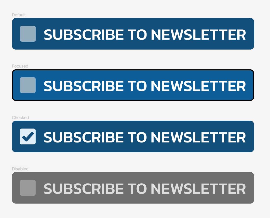
Customize a checkbox so that it looks and behaves like the provided mockup.
Check your solution
- Can be toggled by clicking with a mouse
- Can be toggled by tapping on a touch device
- Can be toggled by tabbing into it with a keyboard and pressing the spacebar
- Can be toggled by doing any of the above on the checkbox label
- When it is focused using a keyboard or hovered using a mouse, the control is visually highlighted
- When the checkbox and its label are hovered using a mouse, the cursor turns into the pointer cursor (hand)
- When the checkbox is checked, the checkmark is clearly visible
- When the checkbox is focused while the screen reader is active, the control is announced as a checkbox
- When toggling the checkbox is while the screen reader is active, the control state is announced
- The visual appearance of the checkbox closely matches that of the mockup
- The checkbox works on any screen
- The checkbox and its label scale when default font size of the browser is increased or decreased without changing the layout
- The checkbox supports the disabled state
- The checkmark is a webfont icon
- The text uses the correct font
Materials
Tools
Keep in mind
The dimensions and color values are intentionally not specified in the mockup, and the mockup is intentionally provided in the wrong scale. This is so that you can train your visual perception.
When viewing the mockup, don't think in absolute dimension. Use the text as the base and determine all other dimensions relative to the text. For this, you will first need to set up the correct font and create a label with the reference text as shown in the mockup.
You can also use the mockup as a background image, and use the
background-position and background-size properties to place the control
somewhere over the mockup. This will give you a reference to worth with. The
best approach is to, again, set up the correct font and use the reference text,
and then scale the background image down to match the live text on the page.
When you are determining the dimensions based on the text size, it is best
to use the em unit. Keep in mind, though, that em isn't the size of the
visible portion of the characters, but an invisible box around them that
would be able to accommodate both the shapes that go above the character (e.g.,
the vertical part of the letter b, called "ascender") as well as those that go
below (e.g., the vertical of the letter q, called "descender").
When it comes to icons, try both the icon font and SVG spritesheet options. See what difference that is make to the markup.
There are several ways to integrate the icon into the markup. With icon
fonts, you can use a pseudo-element like ::before on the <input> itself
(after you reset its appearance). With either icon font or SVG spritesheets,
you also have an option of visually hiding the <input> and then selecting
the element representing the visible icon using the :checked psuedo-class
and sibling combinator. Try all viable approaches.
When styling the disabled state, ideally you want to use the disabled state
of the input itself. This is the most accessible way to do it. In supported
browsers, you can use the :has() pseudo-class for the purpose. However,
also try an approach that assumes this pseudo-class is not available. You
may need to adjust the markup so that you can use sibling combinators
effectively.