Slider widget
Build single- and dual-slider widgets
The way of kata
Kata is an exercise for muscle memory. It's not intended to fill your brain with information but train your fingers to react. The information is there to give you the why, but your fingers need to learn the how.
The material on this page is presented in a specific order — from least specific to highly technical. You will learn the most by jumping in as soon as you have some idea of what you should do. Once you're done, read the rest of the material and check your solution.
All katas are designed to be doable without using 3rd party libraries (and, in fact, the point is to also learn how to do what these libraries do).
To make the best of katas, observe the following rules.
- Don't rush.
- When stuck, take a break and do something unrelated.
- Do not copy/paste code. Always retype everything.
- Do not use AI tools to generate code.
- Try to do something that wasn't in the instructions, experiment.
- Repeat the kata from time to time, even if you think you've got it.
- You have mastered the kata once you are able to complete it without thinking too much.
Remember, the goal is not to get it done, but to get some practice.
Introduction
In this exercise, you will build two slider widgets, one with a single handle, and another with two handles.
Skills you will acquire
- Handling pointer events
- Dealing with event streams
- Using custom CSS properties to control the appearance from JavaScript
- Translating event streams
- Debouncing
- Keyboard support
Objective
- Build a single-handle slider widget
- Build a dual-handle slider widget
Check your solution
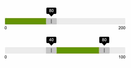
- The page contains two sliders, one single-handle and one dual-handle slider that are styled according to the provided mockup
- The page contains one input that represents the value of the single-handle slider
- The page contains two more inputs that represent the values of the dual-handle slider
- It is possible to drag the handles only within the track
- It is possible to drag the handles even if the cursor moves off the track
- The part of the track that represents the selection made by the handle is highlighted
- When handles are dragged, the matching input's value is updated
- When handles are dragged, a tooltip above them is displayed which shows the current value of the dragged handle
- It is possible to focus (tab into) the handles
- Handles have visible focus indicators similar to a button when they receive keyboard focus
- When the handle is focused the screen reader announces that a slider is focused as well as the current value of the slider
- When the handle is released or dragging stops for a while, the value of the handle is announced in the screen reader
- The handles can be operated using the left and right arrow keys
- The handles can be moved faster by holding the shift key while pressing the arrow keys
Materials
Keep in mind
Sliders consist of three parts.
- track: the outermost background element that represents the total range of the slider's motion and its total (maximum) value.
- handle: a user-operable control that sits within (or on top of) the track
- progress: a visual indication of the portion of the track that represents the current value
The progress sits to the left of the handle for a single-handle slider, and between the two handles in a dual-handle slider.
The handle is a rectangular surface that can be grabbed using a pointer device or touch gesture. The center of the rectangle represents the current position of the slider. The areas to the left and the right of the current position are there to make it easier to grab the handle. You should keep in mind that the left and the right edges of the handle do not represent its position, but still need to fit within the track — the left edge of the handle cannot go beyond the track's left edge, and the right edge of the handle cannot go beyond the right edge of the track. This is important to keep in mind when calculating the position of the handle.
The sliders can have arbitrary developer-specified maximum value, and default to 100 in the absence of this maximum. It may also have a minimum value that defaults to 0. Finally, it has the current value which is mapped to the slider position.
There are three sets of values to think about. What I call the business domain value (or just domain value) of the slider are the min, current and max values of the slider from the standpoint of the end user. The presentation value of the slider is represented on the scale from 0 to 1 where 0 means left and 1 means right. Finally, we also have physical coordinates of the slider and its elements within the viewport/page.
You will need to translate from one set of values to the others depending on the situation.
For example, when you initialize the slider, its current position is calculated based on the initial value, and the minimum and maximum domain values assigned to the slider initially. The minimum will map to 0, the maximum will map to 1, and then the current value maps to a number between 0 and 1.
Similarly, when dealing with physical coordinates during the drag motion, you will translate the left-most coordinate of the slider to 0 and the right-most coordinate to 1, and then map the position of the cursor to a value between 0 and 1.
As the handle is dragged, you will also map the position of the handle — a number between 0 and 1 — to the actual domain value of the slider by reversing the domain-presentation calculation I described above.
The hidden inputs can either be <input type="hidden"> or a visually hidden
(or even visible) <input type="number">. The type of input used will determine
how you approach handle focus.
When you use the type="hidden" input, then the focus actually goes to the
handle element. In this case, the slider widget will need appropriate ARIA role
(role="slider") in order to be perceived as a slider by the screen reader, and
the minium and maximum domain values are represented on the slider widget itself
using the aria-valuemin and aria-valuemax attributes, while the current
value is represented by both the value attribute on the hidden input as well
as the aria-valuenow attribute on the widget itself. Make sure the last
two are kept in sync at all times.
When using a type="number" input, the keyboard focus goes to the input itself,
and updating the value of the input causes the slider to update. The slider
essentially serves as a visual representation of the numeric input(s). Although
the slider handle does not receive focus when using a keyboard, it can still be
operated using pointer devices or touch gestures in order to update the input
value. The field itself can be either kept visible (better) or visually hidden
(acceptable). Regardless of the visibility of the input, the matching handle
should be visually highlighted when the input receives focus. You can either
do this in JavaScript or use CSS combinators and/or pseudo-classes.
When using hidden inputs — either type="hidden" or a visually hidden one — you
also need to provide a tooltip that shows the current value as the slider handle
is operated.
You should try all three options.
The position of the slider should be defined using a custom CSS property. This is discussed in more detail in the Simple progress bar kata, so I recommend doing it first if you have not.
The slider announces its state to the user in some situations. You can use a visually hidden live region for this purpose.
The drag motion consists of three stages:
- Start: the current physical coordinate of the handle is captured for future reference and an event handlers for the movement and release are attached.
- Move: while the handle is moving the position of the slider is calculated, and the custom property representing the position is updated. Additionally, an announcement is made if the movement pauses for a predefined period (e.g., one second).
- Release: when the handle is released, the position is converted to the domain value and assigned to the input. The move and release event handlers are removed when the handle is released.
The slider should be keyboard-friendly. When using focusable input, the value of
the input is simply translated to the slider position whenever the input value
changes. When using a non-focusable input (type="hidden"), you will need
to use keyboard events to add keyboard support.