Code cleanup and vanilla CSS-only view transitions
In the last part, I've finished the MVP of the weather app. The current state of the app isn't very app-like. Apart from the place selection, there isn't much going on – not much to click, drag, toggle. Starting with this part, I'm adding various features to this app so I can cover some of the common patterns in UI development.
Since I'm a little pressed for time this week, this will be a quick one. I'll add a very simple transition between the two pages we have, so that the app feels a bit less janky.
Fixing bugs and code issues
First thing first. I have some dead code that I need to eliminate, and fix a visual glitch in the light mode.
In the getWeatherData(), I have an unused XMLHttpRequest object, a left-over
from the old version.
let getWeatherData = (handleError, handleSuccess) => {
        if (!cachedData) {
            let // ....
                http = new XMLHttpRequest() // <-- this
                // ....
        }
        // ...
    }
I also have an unused localDateISO object in the <x-weather-forecast> custom element.
customElements.define('x-weather-forecast', class extends CustomElement {
    setup() {
        // Date format
        let // ....
            localDateISO = new Intl.DateTimeFormat('en-CA'), // <-- this
            // ....

        // ....
    }
})
In the <x-weather-forecast> I have an unused function, nthDateAfterToday():
customElements.define('x-weather-forecast', class extends CustomElement {
    setup() {
        // Date format
        let DAY_MS = 86_400_000,
            // ....
            nthDateAfterToday = n => {
                let d = new Date()
                d.setDate(d.getDate() + n)
                return d
            }

        // ....
    }
})
I'm pruning this code so it isn't confusing me in the future. When I say prune, I mean literally just delete.
Visually, I have this nasty glitch when light mode is on:
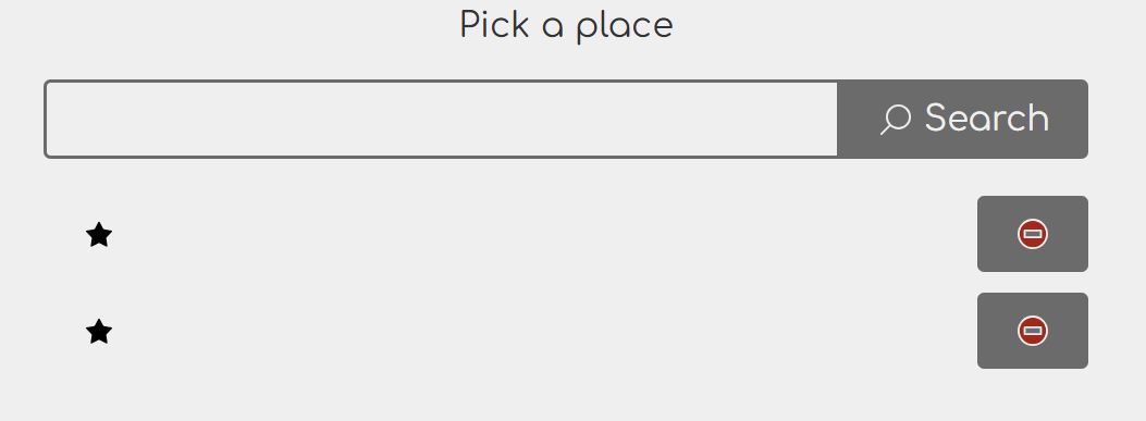
There are two issues in this form. First, the input text color is the same as the background, so it doesn't show up in light mode. Second, the button labels in the previously used places list are invisible for the same reason.
The fix is rather trivial. For the input, I need to specify the text color.
input {
    padding: 0.5em;
    background: transparent;
    color: inherit; /* <-- this */
}
I need to do exactly the same thing in the override for the buttons:
x-places button:first-child:not(:hover):not(:focus-visible) {
    --input-color: transparent;
    --input-text-color: inherit; /* <-- this */
}
View transitions
For some, full page reload is a deal-breaker when I talk about MPA. It creates suboptimal UX, or so the opponents of this approach say. First of all, the evidence on this topic is scarce. You can't prove it either way. There's one thing that's true for sure: if you interrupt the user in the middle of something important, and – even worse – you don't give them an ability to go back to what they were doing, they won't like your app very much.
For those picky users that just cannot use the app because of the page reloads, we now have a new feature that makes the transition much smoother. It's still not perfect, and sometimes it doesn't quite work as you'd expect, but at least it is:
- Easy to add.
- Easy to remove.
- Doesn't require changes to your JavaScript or even HTML.
In other words, it's a cheap solution, so even if it turns out it doesn't work for your users, at least you haven't wasted tons of time.
The newly introduced view transition API allows us to add transitions between two DOM states. This works with the usual single-page apps, of course, but it also works on multi-page apps such as this one. In fact, with multi-page apps, it's even easier as it doesn't involve any JavaScript, and it doesn't break anything for browsers that don't support it.
How view transitions work with MPA
Turns out it works excellent. MPA makes view transition even simpler to use.
First and foremost, this feature is an opt-in. You opt in by using the
@view-transition rule:
@view-transition {
    navigation: auto;
}
This block is always the same. There are no additional bells and whistles as of
this writing. I'm putting all the code related to the view transition into
common.css, so this block also goes there.
If I didn't want any eyecandy, this would be all I need. After adding this, the pages already perform view transitions, where the transition is basically that the new content replaces the old one. This is different from the plain version without the view transitions in that there's no perceivable page refresh.
The view transitions are triggered on navigation. This includes both the usual
navigation resulting from using non-JavaScript-enhanced links and forms, as well
as navigation initiated by JavaScript, such as using location.assign().
When the navigation happens, the browser takes a snapshot of any elements marked
for view transition. If no elements are marked, the whole page is marked as
root and the transition is applied to the page.
Marking is done by using the view-transition-name CSS property, like
so:
header {
    view-transition-name: header;
}

main {
    view-transition-name: main;
}
During the transition, both the old and the new DOM elements remain in the
page until the transition is completed. These extra elements can be
selected as pseudo-elements. In particular, we are interested in the
::view-transition-old() and ::view-transition-new() pseudo-elements, which
let us perform animations and similar visual effects.
:root {
    --view-transition-duration: 0.3s;
}

::view-transition-old(main) {
  animation: slide-out var(--view-transition-duration) ease-out forwards;
}

::view-transition-new(main) {
  animation: slide-in var(--view-transition-duration) ease-out forwards;
}

@keyframes slide-out {
  to {
    transform: translateX(100%);
  }
}

@keyframes slide-in {
  from {
    transform: translateX(-100%);
  }
  to {
    transform: translateX(0);
  }
}
This makes the entire <main> region slide from left to right causing the new content to replace the old as if pushing it to the side. With these large animations, I need to be careful to not cause issues for motion-sensitive users. I can disable the transition by setting the duration to 0, which is why I've defined a custom property for it.
@media (prefers-reduced-motion: reduce) {
:root {
--view-transition-duration: 0;
}
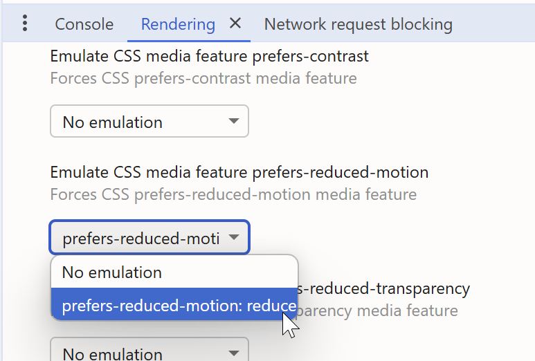
}I can test this by using the developer tools and enabling the "Rendering" tab from within the "More tools" option.
This feature is currently not supported in Firefox, but here's the good part: it will work in browsers that support it, and it won't make the UI unusable in those that don't. It's a good example of what some of us call progressive enhancement.
Lastly, I'm adjusting the height of the header so that it's consistent between pages.
header {
    min-height: 5.5em;
}
As usual, I'm using the min-height property rather than height. This means
that, in the event that the heading content grows beyond 5.5em for some
reason, it won't make it impossible or difficult to see the content. It may not
look pretty, but at least it will be usable. Usable is more important than
pretty in my book. Therefore, my rule of thumb is that there must be a very good
reason to use height over min-height. In fact, I generally advise against
making the layout too rigid to minimize the accidental usability issues.
Conclusion
Rather than make you download the bundle, here's the live version in its current state. In this part, I've covered pruning dead code and fixing embarrassing visual glitches for your amusement, and showed you how to introduce view transitions to MPAs too smooth out the page transitions.
In the next part, I'll be working on charting and providing alternative views of the same data.