Accessible tabbed interface and a simple feature flag
In the previous part, I've finished view transition to make the multi-page experience a bit more attractive. In this part, I'm starting my work on the next feature, which is data visualization.
As much as I would like to finish this feature off this weekend, I'm going to need to split this up into two parts due to time constraints. In this part, I'll do the tabbed interface for switching between the data and charts views, and in the next part, I'll do the charts.
I'll throw in a little extra, though. I'll show you how you can go live with half-baked features without annoying the users.
The content structure
Obviously I now need two sections within the forecast section, so I'm starting there.
<x-weather-forecast>
    <h2 class="alt-text">10-day forecast</h2>

    <section>
        <h3 class="alt-text">Forecast data</h3>

        <!-- .... -->
    </section>

    <section>
        <h3 class="alt-text">Forecast charts</h3>

    </section>

    <!-- .... -->
</x-weather-forecast>
Despite this change, both the CSS and the JavaScript are still working. This is a sign of quality separation between different layers of our code base – one of the vanilla's strengths... if done right. It gives me additional degrees of freedom which is always a welcome thing when I wish to move fast and modify the code fast.
I'm also adding some buttons at the top that I can use to toggle between the two sections. These buttons are effectively tabs – based on which one is active, we are viewing different content.
There are several ways to look at it semantically.
- Set of buttons that activate the sections.
- Plain links that point to respective sections.
- Set of radio buttons that signify the active section.
This is a situation where I have to plan ahead and also consider the visual presentation I'm going for as well as how it affects the implementation.
In terms of the implementation, sing plain links and the straight buttons will require some JavaScript to work. In both cases there's a need to mark the active tab, and in the case of the straight buttons, we additionally need to add information about the button state as well.
The radio button implementation requires no JavaScript, and the radio buttons
represent and maintain their own state. However, with radio buttons, the
implementation might appear a bit hacky. Because the radios have to be
strategically positioned to allow CSS to do its thing, it forces our hand with
regards to the markup, which is not great. This is something that will be solved
over time once :has() becomes more prevalent (I'm giving until next year for
non-supporting browser to flush out), but for now, it is what it is.
Strictly from the technical standpoint, the third option is preferable. The question is whether the resulting code will affect the user experience. The idea with radio-based implementation is usually this:
- Place radio buttons such that they are the common sibling to all elements involved (or their ancestors).
- The the
:checkedpseudo-class with the subsequent sibling combinator (~) to select the appropriate element.
For example, if I want to mark a tab as active, I might do something like this:
input[value="table"]:checked ~ .tabs .tab-data,
input[value="charts"]:checked ~ .tabs .tab-charts {
    /* Styles for active state */
}
To reveal tabs, I might do something like this:
input[value="table"]:checked ~ .content:not(.data),
input[value="charts"]:checked ~ .content:not(.charts) {
    display: none;
}
One thing that stands out is that because I cannot use :has(), I also cannot
put the inputs in a fieldset, and I have to keep the labels separate from the
actual input. This makes the user experience worse for the screen reader users
(they don't know what the common theme between these radios is), and it makes
the code less readable overall, even though it's mechanically simpler (all
moving parts encapsulated by the browser).
There's also a hybrid solution. I can use radios to implement the tab, but not go for the pure CSS solution. I think this strikes the best balance between the clarity of developer's intent in the code and UX.
<x-weather-forecast data-active-tab="data">
    <h2 class="alt-text">10-day forecast</h2>

    <fieldset class="tabs">
        <legend class="alt-text">View mode</legend>

        <label>
            <input class="alt-text" type="radio" name="view-mode" value="data" checked>
            <span class="tab">
                <x-icon name="table"></x-icon>
                <span>Data</span>
            </span>
        </label>
        <label>
            <input class="alt-text" type="radio" name="view-mode" value="charts">
            <span class="tab">
                <x-icon name="chart"></x-icon>
                <span>Charts</span>
            </span>
        </label>
    </fieldset>

    <section id="forecast-data">
        <!-- .... -->
    </section>

    <section id="forecast-charts">
        <!-- .... -->
    </section>

    <!-- .... -->
</x-weather-forecast>
The data-active-tab attribute will be used in CSS to select the active tab.
The styling
For styling, I'm using a classic flex layout with right-aligned tabs:
x-weather-forecast .tabs {
    display: flex;
    justify-content: flex-end;
    padding: 0 0.5em;
    gap: 0.5em;
    border-bottom: 0.1em solid var(--control-color);
}
I give the element containing the tabs a bottom border. This bottom border serves as the top border for the table, so I will also need to change the table styling a bit:
x-weather-forecast tr {
    /* .... */
    border-bottom: 0.1em solid var(--control-color);
}
For the <tr> element, I'm changing the top border to bottom border, and
removing the existing CSS block that had bottom-border assigned to the last row
of the table (a declaration that was never properly applied anyway due to a
typo).
In common.css, I'm again adding a page-specific selector to the shared block. (If I end up doing this one more time, I'll replace it with a .button class.)
input, button, x-current-place a, x-weather-forecast .tab {
    /* .... */
}
Back in index.css, I add the page-specific overrides:
x-weather-forecast .tab {
    --input-color: transparent;
    --input-text-color: inherit;

    display: flex;
    align-items: center;
    gap: 0.5em;
    position: relative;
    top: 0.1em;
    padding: 0.5em;
    border-radius: 0.2em 0.2em 0 0;
}

x-weather-forecast .tab x-icon {
    font-size: 120%;
}

x-weather-forecast .tab span {
    font-size: 87.5%;
}
I've adjusted the font sizes of the <x-icon> and <span> elements to give the
tabs are more balanced look.
The following bit is a little trick:
position: relative;
top: 0.1em;
This pushes the .tab elements one border width downwards. This causes the
bottom border of the tab to overlap with the bottom border of the .tabs
container. This will allow us to 'interrupt' the bottom border where the tab is
active.
I'm styling the active state using the sibling combinator:
x-weather-forecast input:checked + .tab {
--input-color: var(--control-color);
--input-text-color: var(--control-text-color);
background-color: var(--background-color);
border: 0.1em solid var(--input-color);
border-bottom-color: var(--background-color);
}
x-weather-forecast input:focus-visible + .tab {
--input-color: var(--control-highlight-color);
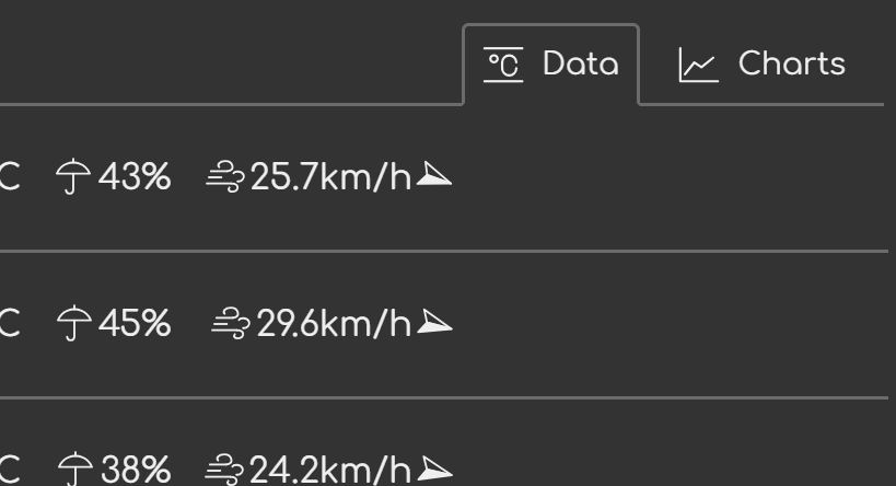
}The final result looks like this:
Finally, I'll add styling that toggles the tabs.
x-weather-forecast[data-active-tab=data] > section:not(#forecast-data) {
    display: none;
}

x-weather-forecast[data-active-tab=charts] > section:not(#forecast-charts) {
    display: none;
}
By using the :not() pseudo-class, I minimize the amount of code I need for
this. I leave it up to you to figure out why it works, if you're curious.
The behavior
Last but not least, I'm adding the behavior. For this I could take three approaches.
- I could treat the feature as forecast-specific (which it is, right now).
- I could treat is as pluggable behavior create a function that will instrument the relevant elements.
- I could also create a new custom element that wraps the relevant elements and adds the appropriate behavior.
The first option is least complex, but since the tabbed interface is so obviously a reusable concept, it would be worth the extra effort to do the second option.
Here's what I mean by the third option:
<x-weather-forecast>
    <h2 class="alt-text">10-day forecast</h2>

    <x-tabbed-interface>
        <div data-tabs>
            <!-- .... -->
        </div>

        <section data-tab-content="data">
            <!-- .... -->
        </section>

        <section data-tab-content="charts">
            <!-- .... -->
        </section>
    </x-tabbed-interface>
</x-weather-forecast>
Considering the boilerplate for the custom element, plus the additional code needed to make it all work, it's not appropriate for this app where we only have one tabbed interface right now, even considering that we might have more in the future. The benefit of being able to add new tabbed interfaces using just HTML comes at a cost that makes no sense now.
Going back to the second option.
The idea is very simple. I'll listen to the change event on the <fieldset>
element, grab the value of the input, and set it as data-active-tab. I think
this is the most minimal implementation I could come up with.
In common.js I'm adding this function:
let tabbedUI = (container, tabs) => {
        tabs.onchange = ev => {
            container.dataset.activeTab = ev.target.value
        }
    }
The function uses a delegated event listener on the <fieldset> element (or any
other radio buttons' common ancestor). If you've followed my earlier writing,
you know that a delegated handler for click events requires looking up the
correct event target. Like so:
someAncestor.onclick = ev => {
    let button = ev.target.closest('button')
    if (!button) return
    // Do something with the button
}
In the case of the click event, we have to do that because the event can be
triggered by just about any element on the page, including the descendants of
the elements we're actually interested in, or elements that are unrelated to
them like those outside the <button> but still within the same common
ancestor. Because of this, there's a need to determine the correct target. With
the change event, we don't need all this because it only gets triggered on a
few elements, and there's no scenario where a change event happens on a
descendant and then propagates up to the actual target.
In index.js, I'm importing it and applying to our tabs:
import { CustomElement, makeTabbedUI } from './common.js'

// ....

customElements.define('x-weather-forecast', class extends CustomElement {
    setup() {
        // ....

        makeTabbedUI(this, this.querySelector('.tabs'))

        // ....
    }
})
That's that. After brief testing, I'm calling it done.
Going live with half-baked features
My tabs are done, and I'm eager to push this code live, but the feature as a whole isn't done. Can I still publish it?
In this particular case, there's no pressure to push this live. After all, it's just a small toy project for the purposes of writing this blog. However, I'll use this opportunity to show you how to do poor man's feature flags for those cases when we actually have to do it.
First I add the hidden attribute to the <fieldset>. This marks it as hidden,
meaning it behaves as if it's not in the document tree at all, as far as
semantics go.
<fieldset class="tabs" hidden>Next, I need to adjust the styling. Even though a hidden element is marked as
hidden, it can still be visible if a display property is set to anything other
than none in CSS. To address this, I'm adding a :not([hidden]) pseudo-class
to the selector:
x-weather-forecast .tabs:not([hidden]) {
    display: flex;
    /* .... */
}
If I reload the page now, I see no tabs. If I want to test the tabs, I can
remove the hidden attribute manually.
Conclusion
In this part, I've walked you through the implementation of a tabbed interface, a common pattern in UI development. I've briefly touched on various implementation strategies, and why I pick specific ones (this time). We also covered poor man's feature flags.
The live version of the code can be found here.
In the next part, I'll work on the SVG-based data visualization of the forecast.