Webfonts, asset preloading, responsive grid layouts
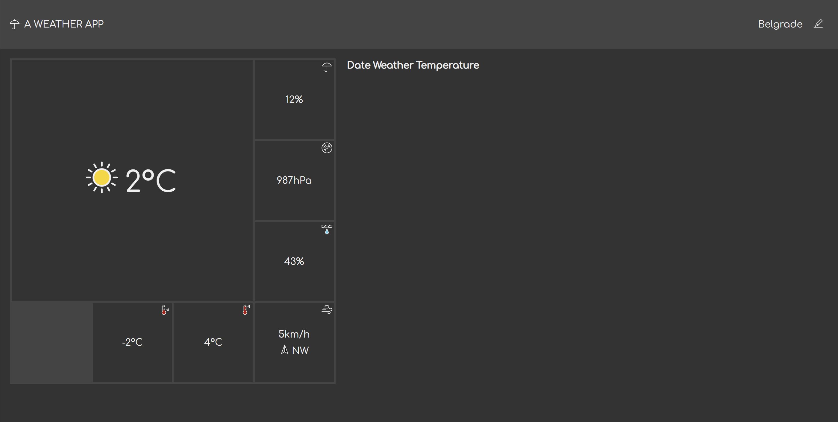
In the previous part, I've finished the basic content structure for the forecast page. In this part, I'll do the presentation – the CSS.
Now this page is a bit more complex than the place search one. Therefore, I will be doing a lot of "messing around", which is basically tweaking of the CSS to achieve some effect. I'm not going to describe the messing around for every little thing, because that's going to require me to write a book – and a very boring one at that. Instead, I'm simply going to present you with the final result. I just want you to know that a bit of trial and error goes into that.
Changing the font
In the past iterations, I haven't dealt with webfonts. That's mostly because I wasn't intending to, but then would the stylesheet be complete without a custom font? Of course it would, but it doesn't sound so dramatic if I said so, does it?
After a bit of looking around, I found a rounded sans-serif font called Comfortaa. I particularly like the modern geometric look of the font, and I think the rounded stokes will go nicely with the icon theme. I also believe in synchronicity. Using this font sounds almost intentional – the reason we check the weather is we want to feel comfortable, after all. 😅
When I deal with fonts, I never link to the copies on the Google Fonts servers. Doing this can throw you into compliance issues even if you don't really care about user's privacy and all that, so I think it's a good idea to serve them from your own servers/CDNs. This might have changed when you're reading this, but as of right now, using fonts via the Google Fonts servers isn't a GDPR-compliant way of doing it. It counts as a 3rd party processing personally identifiable information without consent.
What I do instead is download the font, convert to a webfont myself, and host the font on the same server as the rest of the assets. For conversion, I use Transfonter.
To download the font, I use the "Get font" button to access the download page.
From the download page, I can either click "Download all", or the "Download"
icon next to the font. In the downloaded zip file, there's a static folder,
which contains the goodies.
The static folder contains several files, one for each weight. I'm only going
to use the 'regular' weight in this case. This means I lose the option to bold
the text for emphasis, but that's fine. I can still emphasize text using
capitalization, size, color, etc. I'm not going for the 'light' weight, because
it's too thin (in my opinion) and won't render well at small sizes, especially
on non-MacOS computers at smaller sizes (so yes, that means you should not test
pages only on MacOS and think what you see is relevant to the majority of your
users).
I upload the single file to Transfonter, and generate the webfont bundle
with the default options. The bundle it generates comes with two font files,
in .woff and .woff2 formats, and a stylesheet. The font files go into
the same folder as all other files (remember, I'm using a completely flat
hierarchy), and I copy thee contents of the stylesheet to the top of the
common.css:
@font-face {
    font-family: 'Comfortaa';
    src: url('Comfortaa-Regular.woff2') format('woff2'),
    url('Comfortaa-Regular.woff') format('woff');
    font-weight: normal;
    font-style: normal;
    font-display: swap;
}
This block is placed at the top of the CSS so that the font file URLs are discovered as early as possible. Additionally, I'm also going to add preload.
<link rel="preload" href="Comfortaa-Regular.woff2" as="font" type="font/woff2" crossorigin="anonymous">I add this as the first <link> tag to page. This goes in both the index.html
and place.html.
Why is there only one preload link if we have two font files? Well, keep in mind that browsers only need one of them, never both. Whether they pick woff or woff2 depends on whether they support the newer version or not. The preload improves the performance for the newer browsers (which is the majority of them right now). For the older browser... the preload is ignored. That's fantastic if you think about it – it won't cause the older browsers to download both files.
With this in place, the font now loads in parallel with the stylesheet. It will still not load before the stylesheet, so a standard sans-serif font still show initially. Frankly, the difference is pretty much negligible regardless of what the network tab is telling me, because all the code is so tiny. You could say it's a premature optimization. However... it's a premature optimization that cost me only one line and has no negative side-effects. I'll take it.
Adding the common stylesheet
I'm adding the common stylesheet to the page.
<html lang="en">
    <head>
        <!-- .... -->
        <link rel="stylesheet" media="screen" href="common.css">
        <!-- .... -->
    </head>
    <!-- .... -->
</html>
Reviewing the content structure
Since I wasn't quite sure about the content structure last time, I ran into a few cases this time that didn't quite fit the presentation I was going for.
Last time I had decided to keep the visible labels for all weather information in the current weather section. This is ideal from the accessibility standpoint, but it will probably not fit on a smaller screen. Therefore, I'm adding new icons to that section. While I'm at it, I'm also going to insert hard-coded values for each piece of information (e.g., 2°C for temperature).
<dl>
    <div class="current-temperature">
        <dt class="alt-text">Current weather and temperature</dt>
        <dd>
            <x-icon name="sunny"></x-icon>
            <span>2°C</span>
        </dd>
    </div>
    <div class="min-temperature">
        <dt class="alt-text">Minimum temperature</dt>
        <dd>
            <x-icon name="temp-min"></x-icon>
            <span>-2°C</span>
        </dd>
    </div>
    <div class="max-temperature">
        <dt class="alt-text">Maximum temperature</dt>
        <dd>
            <x-icon name="temp-max"></x-icon>
            <span>-2°C</span>
        </dd>
    </div>
    <div class="precipitation">
        <dt class="alt-text">Precipitation probability</dt>
        <dd>
            <x-icon name="precipitation"></x-icon>
            12%
        </dd>
    </div>
    <div class="pressure">
        <dt class="alt-text">Atmospheric pressure</dt>
        <dd>
            <x-icon name="pressure"></x-icon>
            987hPa
        </dd>
    </div>
    <div class="humidity">
        <dt class="alt-text">Humidity</dt>
        <dd>
            <x-icon name="humidity"></x-icon>
            43%
        </dd>
    </div>
    <div class="wind">
        <dt class="alt-text">Wind</dt>
        <dd>
            <x-icon name="wind"></x-icon>
            <span class="wind-speed">5km/h</span>
            <x-icon class="wind-direction" name="wind-direction"></x-icon>
            <span class="wind-direction-label">NW</span>
        </dd>
    </div>
</dl>
With these changes, I can move on to styling.
Adding new icons
As before, I search the project for all usages of the <x-icon> element,
and add a bunch of new icons. Additionally, I'm adding the weather icons.
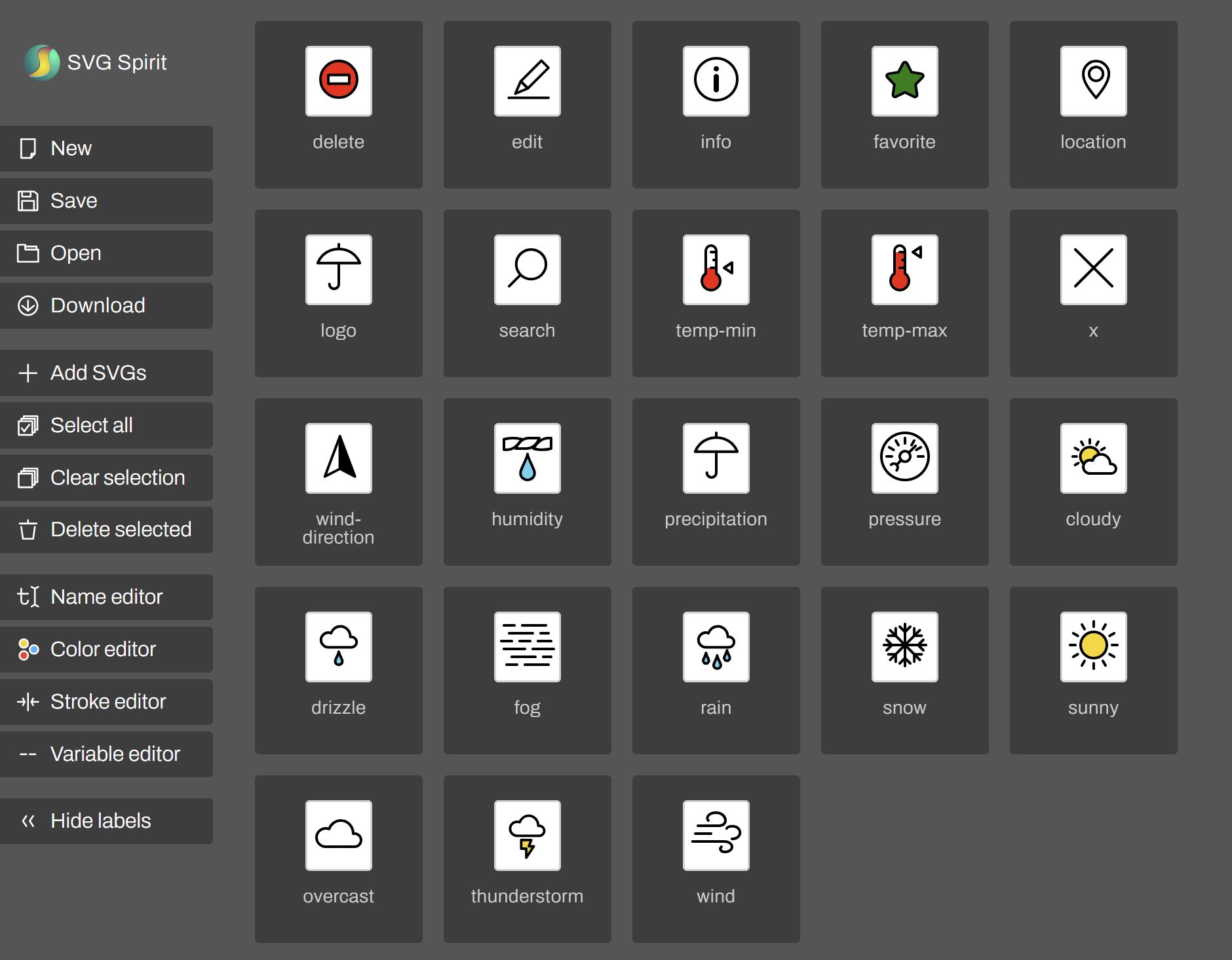
I'm not entirely counting on the icons to describe exactly what they are about. I find that it's generally very difficult to do this save for fairly common and standardized icons such as edit, info, location, close (x). Therefore, I count on the icon to work within a context, in conjunction with other information on the page (e.g., hPa unit that suggest atmospheric pressure), rather than in isolation.
I also count on them to be learnable symbol that will eventually replace the meaning user assigned to it (e.g., help the user orient themselves when layout changes). For these icons, it's therefore more important that they are distinct.
Reset adjustment
Since I haven't used <dl>, <dt> and <dd> before, I need to add them to
the global reset in common.css.
html, body, h1, h2, h3, h4, ul, dl, dt, dd {
    margin: 0;
    padding: 0;
}
I will also need to reset the table header cells:
th {
    font: inherit;
}
For now this is all the additional reset I need.
The header
One thing I need to adjust as far as the header goes is the horizontal layout. I need to make sure the logo and the place switch controls are spread out:
body > header {
    /* .... */
    justify-content: space-between;
    /* .... */
}
In the index.css file, I'm declaring the layout of the current place widget:
x-current-place {
    display: flex;
    align-items: center;
    gap: 0.5em;
}
Nothing special. Just a simple flex layout.
The control to change the selected place is just a link. I am styling it to
look like a button, but only when focused or hovered. Since the button style
is defined in the common.css, I'm going to add the selector for this link
there.
input, button, x-current-place a {
    /* .... */
}
Additionally, in the index.css, I add styles specific to this use case:
x-current-place a {
    --input-color: transparent;
    --input-text-color: inherit;

    padding: 0.5em;
}

x-current-place a:is(:hover, :focus-visible) {
    --input-color: var(--control-color);
    --input-text-color: var(--control-text-color);
}
The selector that's specific to index page ended up in common.css. This is
currently the only real gripe I have with CSS. This definitely makes the
code harder to maintain. Copying the CSS would make it even worse, though,
so I didn't want to do that.
I could also introduce a build step just for this, but... I don't want to go there.
Weather summary layout
I'm going to work out the weather summary. Unlike your typical day job, I'm designing the UI as I go, so I need to first figure out the individual bits before I figure out how they will fit together. If I have a mockup, or a napkin sketch, I can do it the other way around, but this time I'm working off a vague idea in my mind.
I know I wan the individual pieces of information to be in tiles. I also know I want the weather condition and current temperature to be a big tile.
After thinking about this for a while, I'm settling on the grid and media queries. The initial layout looks likes this:
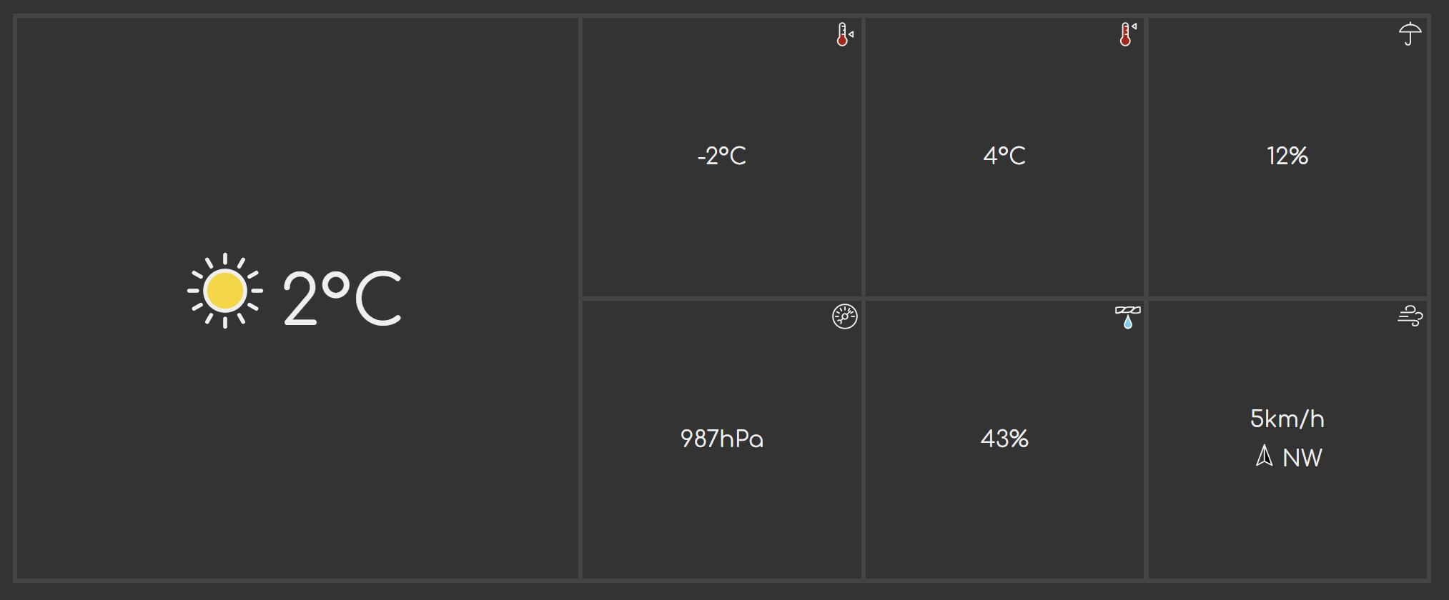
First I define the grid layout. I have 7 tiles in total. One large one, and six small ones. The big one goes on the left, and then I have a neat 3×2 matrix.
x-weather-summary dl {
    --columns: 5;
    --rows: 2;
    --template-areas:
            "m0 m0 w1 w2 w3"
            "m0 m0 w4 w5 w6";
    --tile-border: 0.2em;

    display: grid;
    grid-template-columns: repeat(var(--columns), 1fr);
    grid-template-areas: var(--template-areas);
    gap: var(--tile-border);
    padding: var(--tile-border);
    aspect-ratio: var(--columns)/var(--rows);

    background: var(--secondary-background-color);
}
CSS custom properties are great. I can separate the things I care about from
thee things I care less about, and later I'll be able to override only those
parts of the declaration block by overriding only the CSS custom properties.
(You'll see it later). In this case, I know I'm going to be manipulating the
grid layout, and for that I need the column count, row count, and the template
area labels. The last one, --title-border is for readability, so I know what
the number means: I'm using the background colors to draw a fake border.
I don't give the rows any explicit height. These are defined later by giving each child an aspect ratio.
The template areas are named using 2 characters. You will frequently see people
use a b c, x y z, and similar one-letter names. I find it's virtually
impossible to reliably rename those, so I opt for two-character names. The
reason I use letter-number combination is that it's less likely to also appear
somewhere else in the code compared to arbitrary two-letter combinations. In
this particular case, m0 stands for 'main area' (temperature and weather
condition), and w* are the other weather info tiles, 1 through 6. At any rate,
I always make sure they are all the same length, so I can visualize the layout –
it's easier to do when the characters align.
Every tile is wrapped in its own <div>, so I'm targeting those, and giving
each tile a flex layout to center the contents, and I'm also giving them an
aspect-ratio of 1 so they're always square regardless of the layout.
x-weather-summary dl > div {
    position: relative;
    display: flex;
    align-items: center;
    justify-content: center;
    aspect-ratio: 1;

    background: var(--background-color);
}
Finally I assign each of the elements to the grid areas. This will give me more flexibility in defining the layouts. The trade-off is that I will need to redo the layout every time I add or remove any detail. For what I had in mind in terms of the presentation, it was a necessary trade-off as you will see shortly.
x-weather-summary .current-temperature {
    grid-area: m0;
}

x-weather-summary .min-temperature {
    grid-area: w1;
}

x-weather-summary .max-temperature {
    grid-area: w2;
}

x-weather-summary .precipitation {
    grid-area: w3;
}

x-weather-summary .pressure {
    grid-area: w4;
}

x-weather-summary .humidity {
    grid-area: w5;
}

x-weather-summary .wind {
    grid-area: w6;
}
Tile detailing
The big tile should have larger text size:
x-weather-summary .current-temperature {
    font-size: 300%;
}
I also want a vertical layout for the wind section so that the wind direction appears below the wind speed.
x-weather-summary .wind dd {
    display: flex;
    flex-direction: column;
    justify-content: center;
    align-items: center;
    gap: 0.5em;
}
Finally, for all the tiles except the large one, I want the icon that represents the type of weather information to appear in the top left corner:
x-weather-summary x-icon:not(.current-weather-condition):not(.wind-direction-graphic) {
    position: absolute;
    top: 0.2em;
    right: 0.2em;
}
Rather than give each <x-icon> element that represents the information type of
the tile a separate class, I decided to just select all icons and then exclude
the ones I don't want using the :not() pseudo-class.
Layout variations and responsiveness
Now I can deal with other layouts. To get my breakpoints, I reduce the
window width until I reach a point where the layout looks a big squished.
Then I back up a hair, and run my breakpoint bookmarklet to get the
breakpoint width in em.
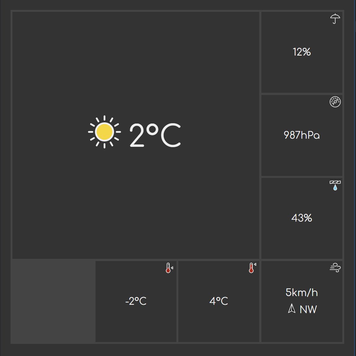
The first breakpoint – point where something breaks – is at 50em. I'm switching to a layout where I have 4 tiles on the right, and 3 on the left.
@media (width < 50em) {
x-weather-summary dl {
--columns: 10;
--rows: 6;
--template-areas:
"m0 m0 m0 m0 w3 w3 w3 w4 w4 w4"
"m0 m0 m0 m0 w3 w3 w3 w4 w4 w4"
"m0 m0 m0 m0 w3 w3 w3 w4 w4 w4"
"m0 m0 m0 m0 w5 w5 w5 w6 w6 w6"
"w1 w1 w2 w2 w5 w5 w5 w6 w6 w6"
"w1 w1 w2 w2 w5 w5 w5 w6 w6 w6";
}
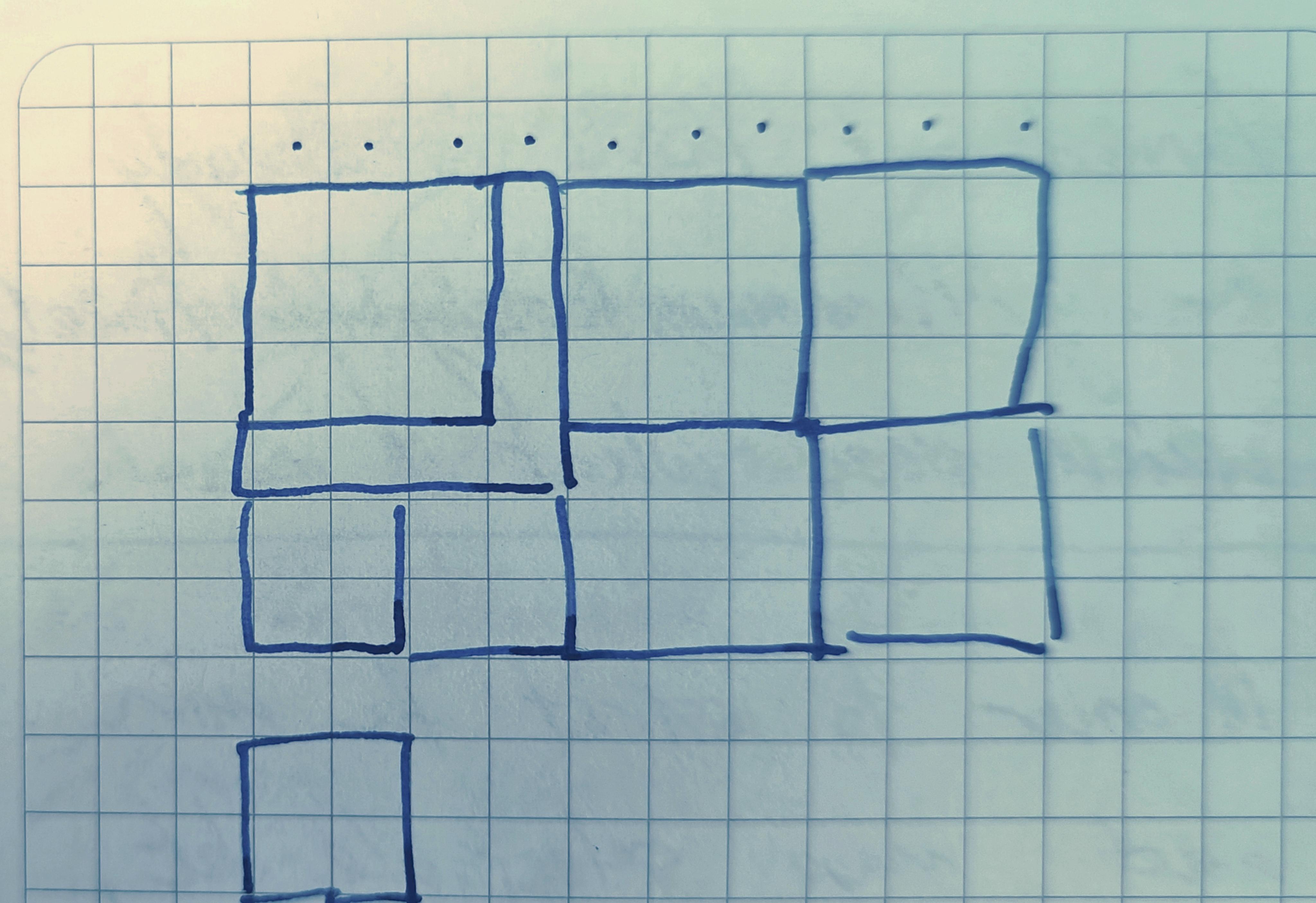
}The reason I have 6 rows for that is elementary mathematics: 6 is the smallest number that is divisible by both 2 and 3 – I have 3 rows in the left group (2 for the big tile, 1 for the small) and 2 rows on the right (2×2 matrix). The 10 columns is derived the same way. I'm joking. I mean, it's all true, but that's not how I arrived at those numbers. I'm not that kind of person. I actually sketched the layout on a square grid notebook to figure out what I need.
The final results looks about the same:
I'm going to quickly reiterate why I'm using em as the media query. For some
reason, some people think this is a bad idea. I assure you that's just paranoia,
and has nothing to do with reality. em media queries work just fine. Before
you react to what I've just said, I will direct your attention to two things
that I never do in this post:
- I never attempt to recalculate that into pixels or vice versa
- I never talk about physical screen sizes
That's the trick. You need to forget pixels and screen sizes even exist. They don't actually matter at all. I know it may be hard to believe, but you're literally seeing it happen throughout this series. You've never seen me talk about pixels (except maybe in the context of SVG sprites and here in this section).
The downside is that you do need something like that bookmarklet to get the
viewport width in em (or rem – it doesn't matter for media queries which you
use), because people making the browser dev tools don't seem to agree with
me. Tbh, I think it's not that big of a loss.
The advantage is that now I don't have to worry about whether the layout will continue to work if the user changes the default font size, zooms in, or anything else that affects the layout. The breakpoint itself is now fully responsive and will adjust itself accordingly. Magic!
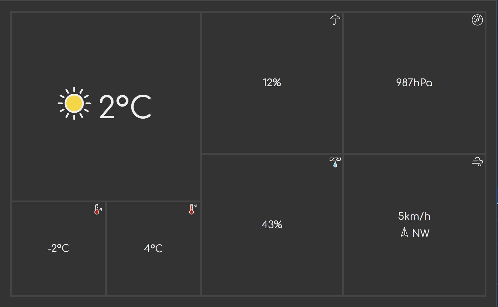
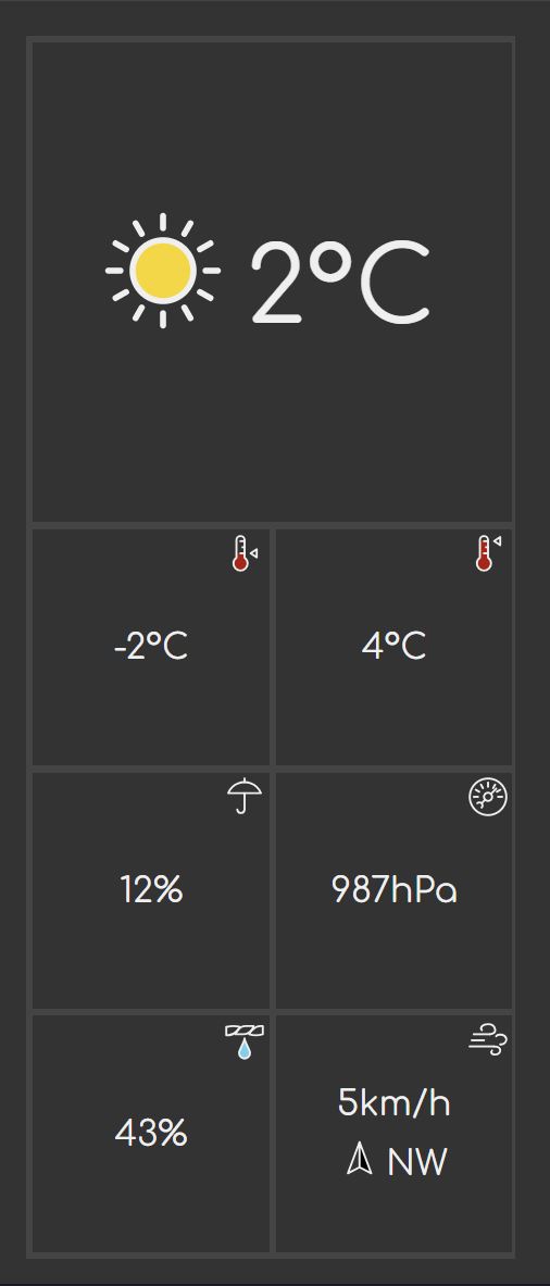
Ok, back to layouts. Moving further down to 36em, I get more breakage, so I adjust the layout as follows:
@media (width < 36em) {
    x-weather-summary dl {
        --columns: 4;
        --rows: 4;
        --template-areas:
                "m0 m0 m0 w3"
                "m0 m0 m0 w4"
                "m0 m0 m0 w5"
                "xx w1 w2 w6";
    }
}
Or in the form of a picture:
And last and the least, at only 26em I adjust the layout two a two-column grid:
@media (width < 26em) {
    x-weather-summary dl {
        --columns: 2;
        --rows: 5;
        --template-areas:
                "m0 m0"
                "m0 m0"
                "w1 w2"
                "w3 w4"
                "w5 w6";

    }
}
Which translates to:
I could technically go even lower, but there isn't much point in doing that. It will not be worth it.
Overall page layout
I'm skipping the forecast section and going for the page layout. The reason for this is that the forecast section is a table, and there isn't much information that would help for the page layout that I would gain from detailing it. My goal is to eliminate unknowns as quickly as possible, so I'm not going to dwell on parts that I already (think I) know what to do with.
My initial thought was that I'd just do the max-width on the <main> element
and be done with it, but decided to do the less lazy version instead. Where the
space permits, I'm going to reuse the 36em breakpoint layout for the summary
(the square one with one blank tile), and lay the forecast out side-by-side
with the summary.
This time I'm going in the opposite direction, expanding the viewport slowly
until the layout starts to feel a bit too sparse. Around 80em it starts to
get a bit too roomy.
I'm modifying the layout for the summary so that the square layout is used
for both <36em and >80em cases:
@media (width < 36em), (width > 80em) {
    x-weather-summary dl {
        --columns: 4;
        --rows: 4;
        --template-areas:
                "m0 m0 m0 w3"
                "m0 m0 m0 w4"
                "m0 m0 m0 w5"
                "xx w1 w2 w6";
    }
}
Multiple media queries can be specified using a comma (,), which is perfect
for this case. In this case, it means <36em or >80em, whichever applies.
The <main> element is the common container for the two sections, so I'm
going to apply the following styles to it:
main {
    display: grid;
    grid-template-columns: 1fr;
}

@media (width > 80em) {
    main {
        grid-template-columns: 34em 1fr;
    }
}
With these changes, I get this past the 80em screen width:
Conclusion
In this part, I've completed some of the styling for the weather information page. I've covered fonts, preloading, CSS grids, and responsive layouts.
I still need to finish off the 10-day forecast section, but I'll leave that for the next part as this is already getting a bit too long.