Visualization using vanilla SVG (part 1)
In the previous part, I've implemented an accessible tabbed interface in preparation of the visualization feature. In this part, I'm going to get started on the visualization.
I'm splitting this into two parts. In the first part, I'll tackle the basic line chart plot, and responsiveness of the plot area. In the next part, I'll be adding the legend and the grid. Adding interactivity to the chart may require a third part.
A few notes about the implementation
Before I get started, I should note that some aspects of this project make my implementation simplistic. (Yes, you've noticed it correctly. I said 'simplistic' not 'simple'.) Each time series in my charts has 10 data points. That's basically nothing in any browser on any device.
This means that I can get away with a fairly naive approach and still get it to work beautifully. If I were dealing with millions of data points, this approach would fail miserably. Also, charts of this size don't require any bells and whistles you'd find on more complex charts, like zooming in, adaptive downsampling (not showing points that you technically cannot see due to limited screen resolution), etc.
Does it mean that doing things this way is not useful in real life? Well, not quite. It clearly works in this case, and this is a real, albeit simple, app. There are plenty of charts where this approach fits. It would comfortably scale to about a few thousand data points, so plotting a month of something (about 30 data points per series), a year of something (about 365 data points per series), etc., should be a piece of cake.
This technique should also serve as a good foundation for more advanced charting, and, more importantly, hopefully a good basis for understanding how charting libraries work.
Content structure changes
In the previous part I've only set up an empty section for the charts. Therefore I'm now adding the charts themselves.
<section id="forecast-charts">
    <h3 class="alt-text">Forecast charts</h3>

    <figure>
        <svg class="chart temperature-chart" viewBox="0 0 100 100" xmlns="http://www.w3.org/2000/svg"></svg>
        <figcaption>
            Temperature chart
        </figcaption>
    </figure>

    <figure>
        <svg class="chart precipitation-chart" viewBox="0 0 100 100"
            xmlns="http://www.w3.org/2000/svg"></svg>
        <figcaption>
            Precipitation chart
        </figcaption>
    </figure>

    <figure>
        <svg class="chart wind-chart" viewBox="0 0 100 100" xmlns="http://www.w3.org/2000/svg"></svg>
        <figcaption>
            Wind chart
        </figcaption>
    </figure>
</section>
Each chart is enclosed in a <figure> element. This allows me to later control
the position of the chart relative to the surrounding area, and not have to
worry about setting up the padding using SVG (it's easier to do with CSS).
Conveniently, a <figcaption>, which is required inside the <figure>, can serve as a text label for each chart.
The styling
I'm going to leave chart-specific styling for later, but for now I'm defining
the layout of the <figure> elements.
First, in the common.css, I'm resetting the margins for the <figure>:
html, body, /* .... */ figure {
    margin: 0;
    padding: 0;
}
I'm also adding this to index.css:
x-weather-forecast figure {
    display: flex;
    flex-direction: column;
    align-items: center;
    gap: 0.5em;
    padding: 1em;

    border-bottom: 0.1em solid var(--control-color);
}
I'm adding to the <figure> element a bottom border to give it a table-like
look. Other than that, it's a standard vertical flex layout.
The charting
On to charting. In this part I'm doing just the line chart part of the feature. No legends, no axis lines, no grids. The bare minimum.
For those of you who are not familiar with data visualization, let me lay down some foundations first. With most simple charts, we are mapping data points to a 2D space. This 2D space is called plot area, and is measured in pixels (in case of SVG and canvas). The set of values within the plot area (the pixes) are called range. The domain is where our data lives and it's measured in units specific to our data. For example, temperature domain is measured in degrees Celsius along the y axis and days along the x axis.
In order to create a line chart, we need a way to map from the domain to the range. It's a simple mathematical formula. In order to calculate the mapping, we also need to calculate the domain extent, which is the range of values that are in the domain. This extent can be calculated from the data, or we can use fixed values if we know them ahead of time.
The formula looks like this:
pixel = (domainValue - domainMin) / (domainMax - domainMin) * (rangeMax - rangeMin) + rangeMin The extent is important because it affects how we interpret the data. For example, if precipitation values are 80% to 96%, and we say the extent is 80% to 96%, then the 80% data point is drawn at the very bottom of the chart as it maps to the lowest end of the range. It suggests that precipitation probability is "low" at that point in time even though 80% is quite high. Therefore, in this case, we have to pick an extent that is 0% to 100% so the user gets the correct perception of how high the probability is.
Lastly, data that indexes domain values the time is called time series (plural is also 'time series' so we'll append 'list' in variable names to differentiate).
To start, I need a function to calculate the extent:
let getChartExtent = timeSeriesList => {
        let min = Infinity,
            max = -Infinity

        for (let ys of timeSeriesList) for (let y of ys) {
            min = Math.min(y, min)
            max = Math.max(y, max)
        }

        return {min, max}
    }
If you look carefully, I have two for loops. In JavaScript, the part after
for (...) is either a single statements or a block of statements enclosed in
curly braces. In this case, the outer for loop only has a single statement,
which is the inner for loop. Therefore, I omit the curly braces. This allows me
to increase the information density in that line. The inner loop has two
statements (assignment to min and max) so it has curly braces. It may look
confusing the first time you see it, but you'll get used to it soon enough, and
I believe it's worth getting used to.
I'm going to define some variables that I'll be using as constants when drawing
the chart. I can't let the chart go edge-to-edge within the <svg> element because I need space for legends to the left and bottom, and I also need to account for the line width. For now, these are going to be just some hard-coded values so I know it works. I'll fine-tune them once I start working on the legends.
let paddingLeft = 20,
    paddingRight = 10,
    paddingTop = 10,
    paddingBottom = 20
I'll add one more thing before I start working on the function to draw the chart:
let createSVG = document.createElementNS.bind(document, 'http://www.w3.org/2000/svg')SVG elements are not the same as HTML elements, so they are created using the
document.createElementNS() function. This function takes the XML namespace as
its first argument, and repeating that gets old very quickly. Here, I'm creating
a version of the function with the first element bound (applied in advance) so
that I can only specify the element name. You'll see its usage later.
To draw a chart, I need access to the <svg> element, the extent, and the
actual time series being drawn. For each time series needs I need the line color
in addition to the series data.
After trying a few different options, here's what I've come up with:
- I cache the extent and data somewhere so I can redraw the chart multiple times.
- I can cache the data on the
<svg>element itself as custom properties, so I can avoid having to manage mappings separately.
Something like this:
let temperatureChart = this.querySelector('.temperature-chart')

temperatureChart.extent = getChartExtent([
    data.daily.temperature_2m_min,
    data.daily.temperature_2m_max
])
temperatureChart.timeSeries = [
    {ys: data.daily.temperature_2m_min, color: 'var(--chart-temperature-min-color)'},
    {ys: data.daily.temperature_2m_max, color: 'var(--chart-temperature-max-color)'},
]

drawChart(temperatureChart)
DOM nodes are JavaScript objects. This means that, as with any object, I can
assign to custom (non-existent) properties, and that gives me a stable reference
to values. This allows me to pass data to the drawChart() function using the
element reference. You'll see how that comes into play later.
The drawChart() function looks like this:
let drawChart = svg => {
        let extent = svg.extent,
            timeSeriesList = svg.timeSeries

        // Reset viewBox
        let parentWidth = this.offsetWidth
        svg.setAttribute('viewBox', `0 0 ${parentWidth} ${parentWidth / 2}`)

        // Draw the charts
        let pathList = svg.querySelectorAll('.time-series'),
            plotWidth = svg.viewBox.baseVal.width - paddingLeft - paddingRight,
            plotHeight = svg.viewBox.baseVal.height - paddingTop - paddingBottom
        for (let i = 0; i < timeSeriesList.length; i++) {
            let path = pathList[i],
                timeSeries = timeSeriesList[i],
                ys = timeSeries.ys,
                color = timeSeries.color,
                stepX = plotWidth / (ys.length - 1),
                rangeYScale =  plotHeight / (extent.max - extent.min),
                domainToRangeX = x => paddingLeft + x * stepX,
                domainToRangeY = y => paddingTop + plotHeight - Math.round((y - extent.min) * rangeYScale),
                d = `M${paddingLeft},${domainToRangeY(ys[0])}`

            for (let i = 1; i < ys.length; i++)
                d += ` L${domainToRangeX(i)},${domainToRangeY(ys[i])}`

            if (!path) {
                path = createSVG('path')
                path.setAttribute('class', 'time-series')
                svg.append(path)
            }

            path.setAttribute('d', d)
            path.setAttribute('stroke', color)
        }
    }
Let me walk you through it.
First I grab the aforementioned extent and time series data from the element reference:
let extent = svg.extent,
    timeSeriesList = svg.timeSeries
The next bit of code is updating the viewBox based on the width of the containing element:
// Reset viewBox
let parentWidth = this.offsetWidth
svg.setAttribute('viewBox', `0 0 ${parentWidth} ${parentWidth / 2}`)
The use of this.offsetWidth is an approximation. I'm actually interested in
the on-screen width of the <svg> element, but I can't get it because it's in a
hidden section. I can technically postpone the rendering until the section is
revealed, but I'll optimized this later. For now, this is good enough. More
importantly, I need to set the viewBox ahead of time because it affects the
range.
On to drawing the lines:
// Draw the charts
let NUM_LINE_SEGMENTS = 9,
    pathList = svg.querySelectorAll('.time-series'),
    plotWidth = svg.viewBox.baseVal.width - paddingLeft - paddingRight,
    plotHeight = svg.viewBox.baseVal.height - paddingTop - paddingBottom,
    stepX = plotWidth / NUM_LINE_SEGMENTS,
    domainToRangeX = x => paddingLeft + x * stepX

for (let i = 0; i < timeSeriesList.length; i++) {
    // ....
}
I grab a reference to all existing path.timeSeries elements. This is a
performance optimization when re-rendering an existing chart. I'm reusing the
existing paths if any.
I'm also calculating some common values and defining functions that apply to all series.
Withing the for loop, I first define the rest of the values and functions that
are series-specific.
let path = pathList[i],
    timeSeries = timeSeriesList[i],
    ys = timeSeries.ys,
    color = timeSeries.color,
    rangeYScale =  plotHeight / (extent.max - extent.min),
    domainToRangeY = y => paddingTop + plotHeight - Math.round((y - extent.min) * rangeYScale),
    d = `M${paddingLeft},${domainToRangeY(ys[0])}`
The d attribute is a space-separated set of instructions that are either M
or L. M stands for 'move' and L stands for 'line to'. Both instructions
move the 'cursor' to the specified location (x and y coordinates), and the
difference is that M does so without drawing anything, while L does so while
drawing a straight line from the previous cursor position. I start the
instruction set with an M. Because only the first instruction is an M, I'm
special-casing it here, so I don't have to deal with it later.
I'm then completing the line:
for (let i = 1; i < ys.length; i++)
    d += ` L${domainToRangeX(i)},${domainToRangeY(ys[i])}`
Before applying the attribute to the path, I must make sure it exists:
if (!path) {
    path = createSVG('path')
    path.setAttribute('class', 'time-series')
    svg.append(path)
}
Lastly, I apply the updated attributes.
path.setAttribute('d', d)
path.setAttribute('stroke', color)
When I'm re-rendering the whole chart, the <path> matching the time series
will already exist. Therefore, I'd only calculate the updated d attribute
value, and apply it to the <path>.
To tie it all together, I'm updating the displayForecast() to include the code
that deals with the charts. To make that work, I first need the references to the <svg> elements.
let /* .... */
    temperatureChart = this.querySelector('.temperature-chart'),
    precipitationChart = this.querySelector('.precipitation-chart'),
    windChart = this.querySelector('.wind-chart')
Then I can render the charts:
let /* .... */
    displayForecast = data => {
        /* .... */

        // Temperature chart
        temperatureChart.extent = getChartExtent([
            data.daily.temperature_2m_min,
            data.daily.temperature_2m_max
        ])
        temperatureChart.timeSeries = [
            {ys: data.daily.temperature_2m_min, color: 'var(--chart-temperature-min-color)'},
            {ys: data.daily.temperature_2m_max, color: 'var(--chart-temperature-max-color)'},
        ]
        drawChart(temperatureChart)

        // Precipitation chart
        precipitationChart.extent = {min: 0, max: 100}
        precipitationChart.timeSeries = [
            {ys: data.daily.precipitation_probability_max, color: 'var(--chart-precipitation-color)'},
        ]
        drawChart(precipitationChart)

        // Wind chart
        windChart.extent = {
            min: 0,
            max: Math.max(
                90,
                getChartExtent([data.daily.wind_speed_10m_max]).max
            ),
        }
        windChart.timeSeries = [
            {ys: data.daily.wind_speed_10m_max, color: 'var(--chart-wind-color)'},
        ]
        drawChart(windChart)
    }
For wind, I use a hybrid extent where 90km/h is taken as a general maximum unless the true maximum in the data exceeds it. 90km/h is the threshold where wind speeds are considered hazardous.
Chart-specific styling
You've noticed I used a bunch of CSS custom properties like
--chart-wind-color. I prefer to manage styling through CSS rather than
JavaScript, so all (or nearly all) styling information lives in one place – keep
things cohesive and separate the concerns better.
I'm adding this to the index.css file:
@property --chart-temperature-min-color {
    syntax: "<color>";
    inherits: true;
    initial-value: #fff;
}

@property --chart-temperature-max-color {
    syntax: "<color>";
    inherits: true;
    initial-value: #fff;
}

@property --chart-precipitation-color {
    syntax: "<color>";
    inherits: true;
    initial-value: #fff;
}

@property --chart-wind-color {
    syntax: "<color>";
    inherits: true;
    initial-value: #fff;
}

x-weather-forecast .chart {
    --chart-stroke-width: 1px;
    --chart-temperature-min-color: rgb(119, 163, 245);
    --chart-temperature-max-color: rgb(229, 30, 30);
    --chart-precipitation-color: rgb(4, 156, 173);
    --chart-wind-color: rgb(36, 188, 74);

    transition-property:
        --chart-temperature-min-color,
        --chart-temperature-max-color,
        --chart-precipitation-color,
        --chart-wind-color;
    transition-duration: 0.3s;

    aspect-ratio: 2;
}

@media (prefers-color-scheme: light) {
    x-weather-forecast .chart {
        --chart-temperature-min-color: rgb(18, 64, 149);
        --chart-temperature-max-color: rgb(138, 5, 5);
        --chart-precipitation-color: rgb(4, 89, 99);
        --chart-wind-color: rgb(10, 89, 30);
    }
}

x-weather-forecast .chart .time-series {
    fill: none;
    stroke-linecap: round;
    stroke-width: var(--chart-stroke-width);
}
If you're wondering why I didn't put the variable definitions in :root, here's
the rationale. First of all, variables don't need to be declared in :root.
They can be declared anywhere. Sometimes it's useful to declare them in :root,
because that provides global defaults that can be overridden in particular
elements. In this case, however, the scope of the variables is well known ahead
of time: they are only used within the .chart elements. Therefore, it's
sufficient to define them for that selector.
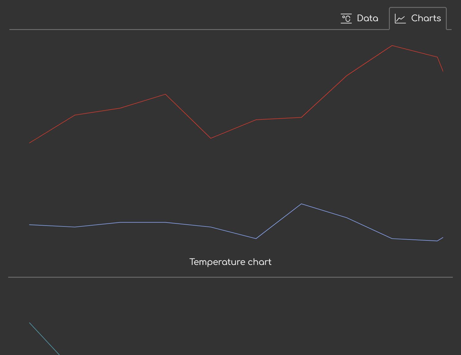
The final result looks like this:
Adding responsiveness
The last but not least, we need to add responsiveness.
if (selectedPlace) {
    // .....

    let debounceTimer

    window.addEventListener('resize', () => {
        clearTimeout(debounceTimer)
        debounceTimer = setTimeout(() => {
            drawChart(temperatureChart)
            drawChart(precipitationChart)
            drawChart(windChart)
        }, 100)
    })
}
First, let me cover why debounce. Resize event has a relatively high trigger rate. It's not so bad the code can't keep up, but then again it doesn't improve the UX that much even if we refresh on every event.
Why debounce and not throttle? The SVG chart does scale even if there's no redrawing. It's just that the stroke width doesn't adjust along with the size. But that doesn't immediately break the UX. It's enough to adjust things just once once the size has settled. This is why debouncing is a better fit than throttling.
Conclusion
In this part, I implemented a 30-something-line (for now) charting function using nothing but SVG, plain CSS, and DOM API. This is the first pass that provides basic line chart with no legend or axis lines.
You can see the live version and the complete code in the Sources tab in your dev tools.
In the next part, I'll be adding the legend and other fixtures to make the charts actually become complete charts.