SVG spritesheet for icons
The in previous part, I've done some basic setup for the location selection page. Today, I'll be dealing with icons. In particular, I'll create the icons themselves, a SVG spritesheet so they can be included on the page, and adjust the existing code to actually render the spritesheet.
A sprite what?
Also known as 'texture atlas' or 'image sprite', a spritesheet is a single image consisting of multiple images that are used independently in the software. This is a technique developed by game developers in the 1970s. Initially it was a technique to optimize storage, and possibly speed up look-up. On the web, spritesheets are typically used to optimize asset loading by bundling together multiple images that would normally require multiple connections to retrieve.
SVG spritesheet?
SVG spritesheet is a SVG file that contains multiple SVG graphics that can be
referenced by id. Normally, these are either stand-alone <g> elements, or
<symbol> elements packed in a <def>. Before I move on to how I create them,
let me first cover why. Apparently, it's not so obvious.
Alternatives to SVG spritesheets include:
- stand-alone images
- image sprites
- icon fonts
- inline SVG
The image-based solutions (PNG, JPG, etc.) whether as an image sprite or or stand-alone images has too many issues it's not even worth considering today (not being resolution-independent is a big one). They were mostly used in the past because the vector-based solutions were not available (no custom fonts, no support for SVG, etc.). We're therefore down to two viable alternatives.
Icon fonts are great. They compress well, and they are well-supported. They also give CSS full ownership over the presentation, which is a great feature. Trade-off? First, we're limited to one color for the entire icon. Not the end of the world, as that's fine most of the time. More importantly, though, users can substitute fonts on your page, and when they do, your icons suffer. The only workaround for this that I know of is to always provide a text-based label so that icons don't carry crucial information about the UI. This is not feasible for a lot of apps though, especially those that need to work on small screens – in other words, most apps.
Inline SVG is the least efficient way to get graphics into your page. Although compression takes care of duplication of code in the different parts of the page, the browser still has to parse it. And/or if you're rendering the SVG client-side, you will need more CPU cycles to do it. The SVG markup also need to be bundled either with the HTML or JavaScript, so it takes longer to load overall. Meanwhile, it doesn't offer that much benefit over the SVG spritesheets other than perhaps not requiring conversion. Although it technically works, I tend to avoid the method.
SVG spritesheets are more efficient than the inline SVG, and don't suffer from the font-replacement issue. They also have a few features that fonts don't. Unlike fonts, you are able to use line art as icons. Like, real line art, not simulated ones in the fonts. This gives you variable line width which can be handy when you want to render the graphics at different sizes (typically smaller size icons will require you to increase the stroke size to compensate, and vice versa). You also get support for full-color graphics. The best part? All of that can be controlled using CSS, including support for CSS variables. Of course, the trade-off is the size. SVG spritesheets are typically at least an order of magnitude larger than the fonts in my (admittedly limited) experience.
Making the spritesheet
I like to draw my icons in Affinity Designer. The choice of software doesn't matter that much, but with Adobe Illustrator, you get SVG spritesheet support almost out of the box – it only requires minor manual touch-up. If you use Illustrator, just stick with it. Learn how to use symbols and convert your icons into symbols.
For the users of other software, or developer receiving SVG icons from a designer, I've developed the SVG Spirit, which is a PWA that converts a set of SVG files into a SVG spritesheet.
Before I draw the icons, I need to find out which ones I should draw. I really
like to hammer home the idea of content structure first, and I highly recommend
this even when an UX designer is involved – you really ought to be able to know
what goes on the page before you flesh out what it looks like. Anyway,
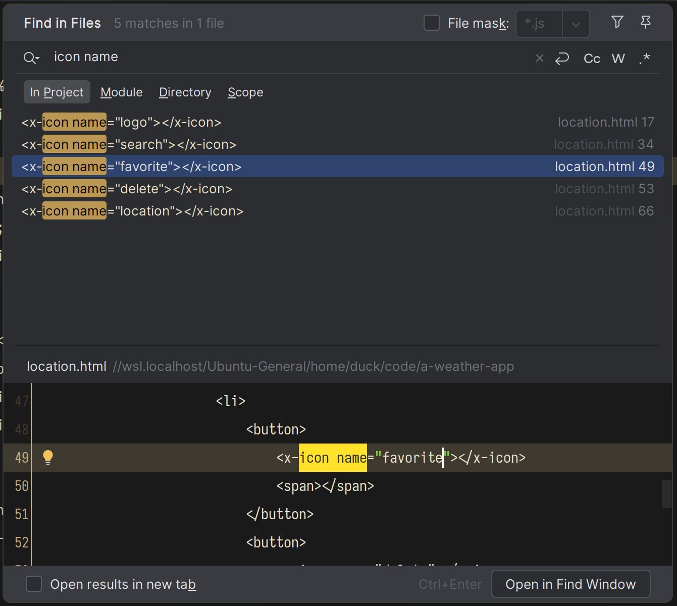
because I've already done the icon names in the markup before I had the actual
icons, just pull up the list by doing a project-wide search for "icon name". No,
it's not some kind of magic keyword. It just so happens that it captures the
part of the <x-icon name="..."> string.
I noticed that I used some non-semantic names last time, so I fixed those. For instance, I was using the name "star" instead of "favorite". "Star" says what it looks like, "favorite" says what it is for (iow, "what we mean by star"). This subtle difference means that if I ever decide that I want favorites to be a heart instead of a star, all I have to do is swap out the graphic without renaming anything. Is this a freaking awesome naming scheme? No, not really. It has its drawbacks. What if two completely unrelated things share the same graphic? You get the point. Now, I could argue that, no, two completely different things should not use the same graphics, and that's also one way to look at it. YMMV.
I drew the icons and I can now compile the SVG spritesheet from them. If you want to follow along, here's the SVGs.
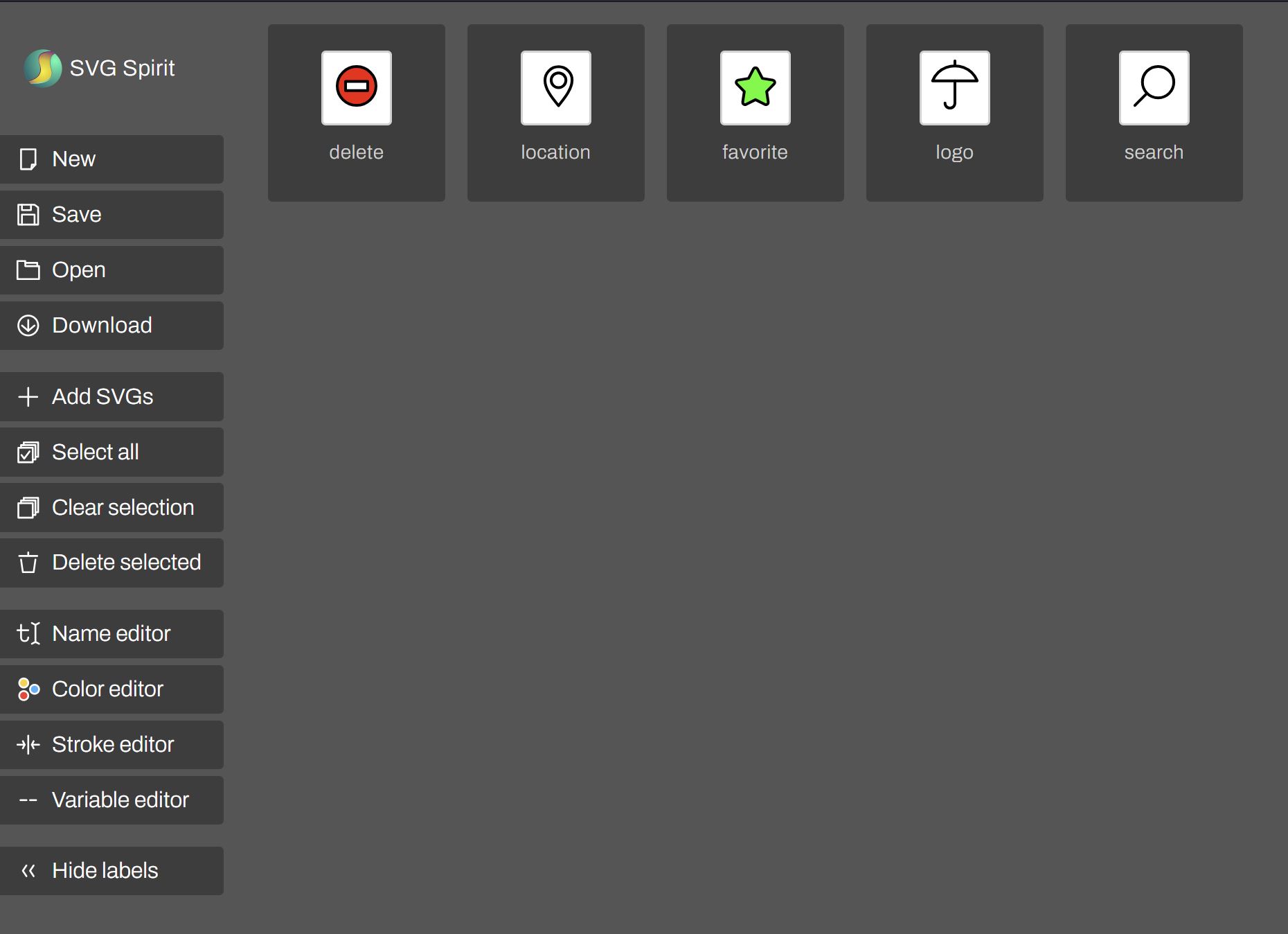
I put the icons in the SVG Spirit and quickly check the names.
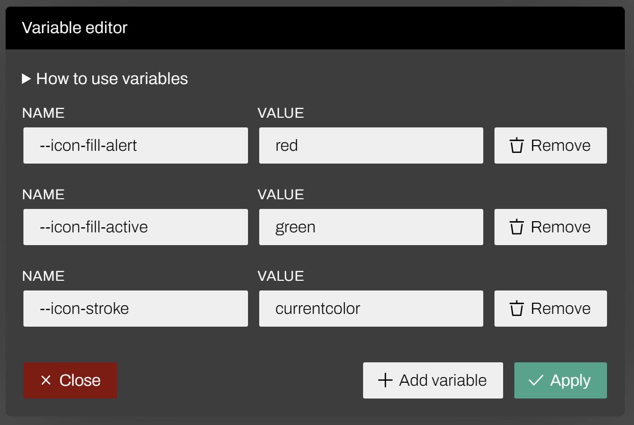
Next I edit the variables. I have 2 fill colors and a stroke color that I would like to control from within CSS.
For the fill, I have the fill of the delete icon, which should be some kind of red (I'll adjust it later in CSS), and the fill of the star. I also want control over the stroke color.
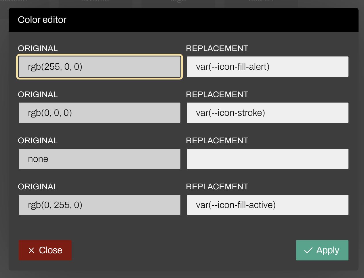
I also want to have control over the stroke width. I didn't technically need to use a custom property (CSS variable) for this, but it's nicer to use it because I can then use the cascade to specify values globally for entire regions of the page.
I give the variable some defaults so I can preview them and check that they're working. Later I will copy this into CSS and tweak further.
(Note t o self: Update the SVG Spirit "design", cause it looks like an ass.)
Under the hood
The generated SVG file looks something like this (depends a lot on the source SVGs).
<svg xmlns="http://www.w3.org/2000/svg">
    <defs>
        <symbol id="delete" viewBox="0 0 24 24"
                style="fill-rule:evenodd;clip-rule:evenodd;stroke-linecap:round;stroke-linejoin:round;stroke-miterlimit:1.5;">
            <path d="M12,5.026c3.863,-0 7,3.136 7,7c0,3.863 -3.137,7 -7,7c-3.863,-0 -7,-3.137 -7,-7c0,-3.864 3.137,-7 7,-7Zm4,5.321l-8,0l0,3.357l8,0l0,-3.357Z"
                  style="" fill="var(--icon-fill-alert)"
                  stroke="var(--icon-stroke)" stroke-width="1px"/>
        </symbol>
        <symbol id="location" viewBox="0 0 24 24"
                style="fill-rule:evenodd;clip-rule:evenodd;stroke-linecap:round;stroke-linejoin:round;stroke-miterlimit:1.5;">
            <path d="M8,9.975c0,-2.703 2.195,-4.898 4.898,-4.898c2.704,-0 4.975,2.196 4.899,4.898c-0.088,3.102 -2.448,6.102 -4.899,9.149c-2.549,-3.047 -4.898,-6.047 -4.898,-9.149Zm4.898,-2.691c-1.47,-0 -2.663,1.193 -2.663,2.663c-0,1.47 1.193,2.664 2.663,2.664c1.47,-0 2.664,-1.194 2.664,-2.664c-0,-1.47 -1.194,-2.663 -2.664,-2.663Z"
                  style="" fill="none" stroke="var(--icon-stroke)"
                  stroke-width="1px"/>
        </symbol>
        ....
The icons are represented by the <symbol> element, which contains the actual
graphic (e.g., the <path> elements in this case). You'll also notice that we
have stroke and fill attributes using custom CSS properties like
--icon-stroke and --icon-fill-alert.
When you're manually adding the icons to your page, you will normally have some markup that looks like this:
<svg class="icon">
    <use href="path/to/icons.svg#icon-name"/>
</svg>
Note: The /> in the <use /> tag is not a mistake. SVG is XML, so
self-closing (or 'void') tags are closed using the /> syntax. In HTML, you
don't need the slash in self-closing tags. JSX syntax borrowed this feature from
XML (that is, the XHTML) probably to simplify the parser.
When you add the SVG to your document using the <use /> element, the
graphic referenced by the URL will be inserted into the <svg> element where
the <use /> element appears, and will be treated as inline svg. This also
means that the now-inline SVG will inherit the page CSS, including any
built-in or custom CSS properties we've defined.
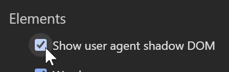
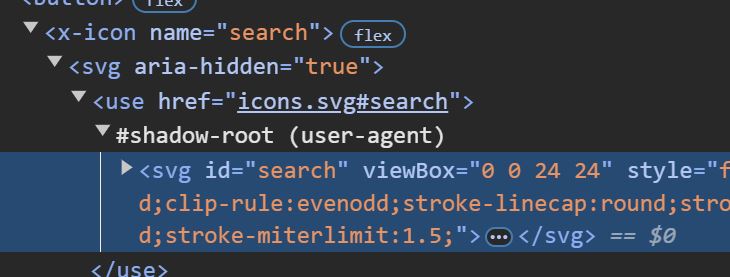
You can also inspect the contents of the SVG in the Chrome developer tools by enabling the "Show user agent shadow DOM" option.
Once enabled, the embedded SVG will be shown as the contents of the <use />
element's shadow root.
Adding the spritesheet to the project
Once I have the downloaded spritesheet as spritesheet.svg I can put it in
the project. As before, I just dump it in the same folder as the rest of the
files. For smaller projects I just like to keep it simple. I can always
reorganize things if I want.
I will name the file icons.svg because that's what I named it in the
common.js module. Speaking of which, I need to update that:
customElements.define('x-icon', class extends CustomElement {
    setup() {
        this.innerHTML = `<svg aria-hidden="true"><use href="icons.svg#${this.getAttribute('name')}"/></svg>`
    }
})
I've added the aria-hidden attribute to the <svg> element, so that it's
not read out loud in screen readers.
For the icon id, I'm using the name attribute value. I don't do any cleaning
of this value (e.g., check that it has no spaces, etc.) because I'm the one
specifying the value, not the end user. Not wasting CPU cycles on something
where the worst case scenario is "Oopsie, there's a typo here." If I ever decide
I (or my colleagues) make that particular typo way too often, I'm just gonna
write a script that finds the usages using regexp and compares it to the id
attributes in the SVG flagging the missing ones. No need for runtime checks.
I'm also noticing I need to fix the CSS for the icons. The icons turn out to be a bit on the small side.
I've already worked out the layout the last time, and I don't want to break
that, so I want the <x-icon> elements to retain the current size, but enlarge
the icon graphics. To achieve this, I'm going to give <x-icon> its own size
(previously it would take on the size of the <svg> element inside it), and
position the <svg> absolutely. I therefore make the following changes in the
common.css:
:root {
    --icon-scale: 1;
}

x-icon {
    flex: none;
    position: relative;
    display: inline-flex;
    width: 1em;
    aspect-ratio: 1;
}

x-icon svg {
    position: absolute;
    width: 100%;
    aspect-ratio: 1;
    transform: scale(calc(varl(--icon-scale) * 1.4));
}
Giving <x-icon> a size of 1em square (square due to aspect-ratio: 1), I
made it keep the 1em size no matter what. Then the child element, the <svg>
is taken out of the layout so it no longer affects other elements, and I scale
it up 1.4× so that it appears 40% larger. Additionally, I've introduced an
--icon-scale custom property that replaces the --icon-size one. With this
custom property I can fine-tune the default 1.4× scale if I need to.
One final adjustment I need to make is the log in the header.
header h1 {
    display: flex;
    align-items: center;
    gap: 0.5em;
    text-transform: uppercase;
}
This is something I could've caught in the previous part had I taken some time to add the default icon graphic to the placeholder SVG. I should remember this for the next time.
Conclusion
In this part, I covered the use of SVG spritesheets. I hope I was able to give you a lot more material and nuance than what the topic suggests.
This also concludes the iteration related to the appearance. In the next part I'm going to work on the behavior.