Responsive tables using a grid layout with subgrids
In the previous part, I've talked about styling. And I've talked about doing more of it in this part. I'm going to finish off the weather forecast section and check if I've missed anything else before I move on to the JavaScript bits.
Dummy content
As before, I'm going to add some hard-coded dummy content to the markup. For the dummy content, I will use the markup from the template.
When working with clean vanilla code, I really appreciate the full feature set of the IDEs. For instance, in the past, while I was still messing with frameworks, I could never fully appreciate the outline view. But with vanilla code, I use it a lot more often, not just in JavaScript, but also CSS and HTML, like, say, when I need to locate the section I'm going to work on:
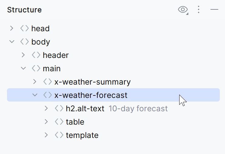
Most of the time, this replaces my filesystem-based code organization.
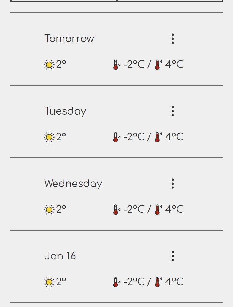
I won't bore you with the markup as there's just too much of it. Refer to the part 6 for the template markup. When filling in the blanks, I decided to experiment with the display of the date so that it's formatted in a way that I think would be a bit closer to how we talk about days. For instance, tomorrow's forecast has "Tomorrow" in the date column, and the next two days have the week day names (e.g., "Wednesday", "Thursday") instead of the date. Days after the first three are using dates, as usual.
The unstyled result looks like this:
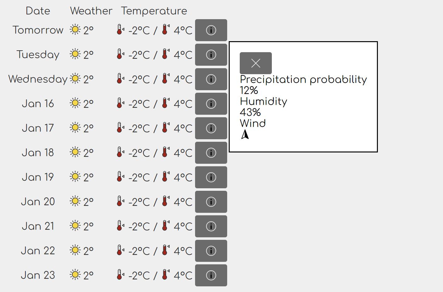
I've added the open attribute to the dialog in the developer tools to
reveal the contents of the dialog, just for look-see. It actually needs to
be a modal dialog, so it will be opened in a different way later.
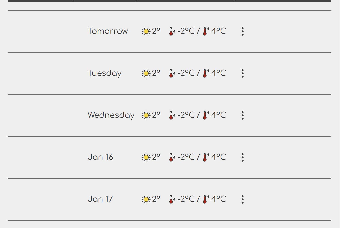
I'm noticing an issue with the info icon, which I'll address separately. I'm also noticing a bigger issue, which is that I'm missing a column header cell for the last column. I'm adding one now.
<tr>
    <!-- .... -->
    <th scope="column">More</th>
</tr>
There's one thing I really really hate about tables on the web, and it's really no fault of the developers or UX designers – when a table stretches across the width of the page, the spacing between the column contents become so large that it breaks the visual cohesion (principle of proximity in Gestalt). Ideally, only the horizontal lines that delimit the rows should stretch edge-to-edge, while the column contents should either align to the leading edge (left when writing left-to-right, right otherwise), or the center. This is an unfortunate oversight in CSS. The only workaround that I'm (currently) aware of is to use the grid.
Normally, a table markup looks like this:
<table>
    <thead>
        <tr>
            <th></th>
        </tr>
    </thead>
    <tbody>
        <tr>
            <td></td>
        </tr>
    </tbody>
</table>
In CSS grids, I don't really need this kind of elaborate markup – though, as
you'll see, it does gets replaced with elaborate CSS. However, I can't just
tweak the markup as I please just to suit the presentation. Markup is the
carrier of the content semantics, and this is semantically a table.
(Incidentally, many accessibility issues are caused by markup tweaked to suit
the presentation, one of the most common example being a <div> that represents
a button.) Luckily, with a few CSS tricks, I can still achieve what I need using
some of the newer CSS features.
First I'm making the <table> element a grid container. I want the cells to
group in the middle. To achieve this, I'm going to create two fake columns
on either side of the actual columns, and I'll set their widths to 1fr.
These fake columns will effectively squeeze the content into the middle.
x-weather-forecast table {
    display: grid;
    grid-template-columns: 1fr repeat(4, auto) 1fr;
}
Now, as I mentioned before, there's some intermediate markup that gets in the
way of laying out a clean grid for this, so I'll need to make sure the <tbody>
is not getting in the way. (I've already marked <thead> as .alt-text so it's
invisible and removed from the layout.)
x-weather-forecast tbody {
    display: contents;
}
The display: contents property instructs the CSS to treat the selected
elements as non-existent. The layout engine will basically ignore <tbody> and
will treat its children – the <tr> elements – as the direct children of the
<table> element. Neat, huh?
Up next, I want each table row to have top and bottom borders that span the entire width of the page. It will need to take up all the columns of the table. You may be wondering if I could've just used a single-column layout or no grid at all for this, but here's the catch. I do need the 6-column grid because I want to use a subgrid for the actual table cells. If I use separate grids for each row, the cells will not align among themselves!
x-weather-forecast tr {
    grid-column: 1/7;
    display: grid;
    grid-template-columns: subgrid;
    padding: 1em 0.5em;
}
By using grid-template-column: subgrid on the table, I'm basically saying
that the <tr> element, which is a grid itself, should inherit the grid
layout of the parent – the <table> element.
I will also give each row a border. Unlike the real table, I cannot use the
border-collapse in a CSS grid. Therefore I use the old-school method of adding
the top border to all rows, and the bottom border only to the last one:
x-weather-forecast tr {
    border-top: 0.1em solid var(--control-color);
}

x-weather-forcast tr:last-child {
    border-bottom: 0.1em solid var(--control-color);
}
The layout of the individual cells is a standard flex layout. All columns are right-aligned except the first one, which is left-aligned for better scanning when going vertically to find a particular date.
x-weather-forecast :is(th, td) {
    display: flex;
    justify-content: flex-end;
    align-items: center;
    padding: 0.5em;
    gap: 0.2em;
}

x-weather-forecast th {
    grid-column: 2;
    justify-content: flex-start;
}
After a bit of experimenting, I've worked out two breakpoints for the table: one
at 26em and another one at 20em. Refer to the previous part or this
post for information on how I come up with breakpoints. Luckily, the 26em
breakpoint coincides with the one of the breakpoints of the weather summary, so
I don't need to adjust anything. Usually I'd synchronize breakpoints that are
close to each other for a less jarring UX.
The table itself goes from 4 + 2 columns (4 main + 2 fillers) to 2 + 2, and then down to just 2 columns without fillers.
x-weather-forecast table {
   /* .... */
   grid-template-columns: 1fr repeat(4, auto) 1fr;
   /* .... */
}

@media (width < 26em) {
    x-weather-forecast table {
        grid-template-columns: 1fr repeat(2, auto) 1fr;
    }
}

@media (width < 20em) {
    x-weather-forecast table {
        grid-template-columns: auto auto;
    }
}
I'm also varying the areas defined at the <tr> level depending on the number
of columns. At 26em, I'm going for a layout where the day and the menu button
are side-by side in the first row, and then the actual data is in the second
row, also side by side.
@media (width <= 26em) {
    x-weather-forecast tr {
        grid-template-areas:
            "fl w1 w4 fr"
            "fl w2 w3 fr";
    }
}
At 20em, I switch to a 3-row layout where the title and button are
side-by-side in the first row, then the details in rows 2 and 3, one row per
detail.
@media (width < 20em) {
    x-weather-forecast tr {
        grid-template-areas:
            "w1 w4"
            "w2 w2"
            "w3 w3";
    }
}
Finally, I adjust the alignment of the cells appropriately:
@media (width <= 26em) {
x-weather-forecast .weather {
justify-content: flex-start;
}
}
@media (width <= 20em) {
x-weather-forecast .temperature {
justify-content: flex-start;
}
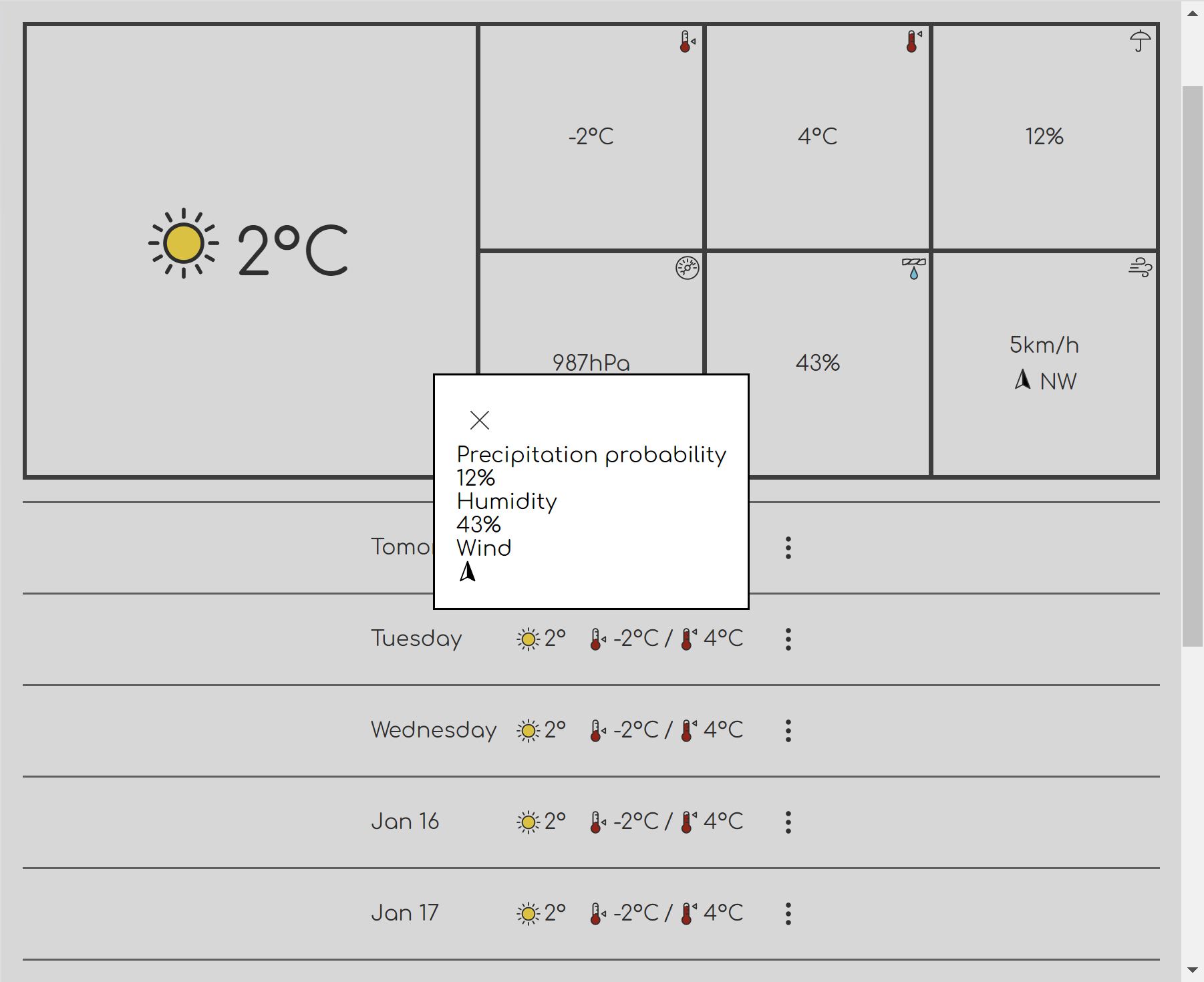
}At full width, the table looks like this:
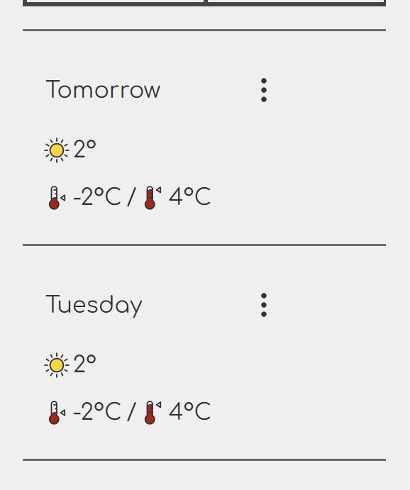
Below 26em, it switches the layout like so:
Lastly, below 20em, the table goes single-column (mostly):
The additional information feature
The additional information feature consists of a button and a modal dialog. This is present in every row, and must be activated with JavaScript. The default appearance of the button is very much in-your-face. I want it to be just an icon on transparent background, and look like a button when it is hovered. This is the same appearance as the link for changing the current place. I will also fix the icon while I'm at it.
For the CSS, it's a classic override, targeting <button> elements within
the .additional-information element.
x-weather-forecast .additional-information button {
    padding: 0.5em;
}

x-weather-forecast .additional-information button:not(:hover):not(:focus-visible) {
    color: inherit;
    border-color: transparent;
    background: transparent;
}
Although I can technically list selectors under a single :not(), I use
multiple :not() pseudo-classes here because some older versions of Safari
don't support multiple selectors in :not().
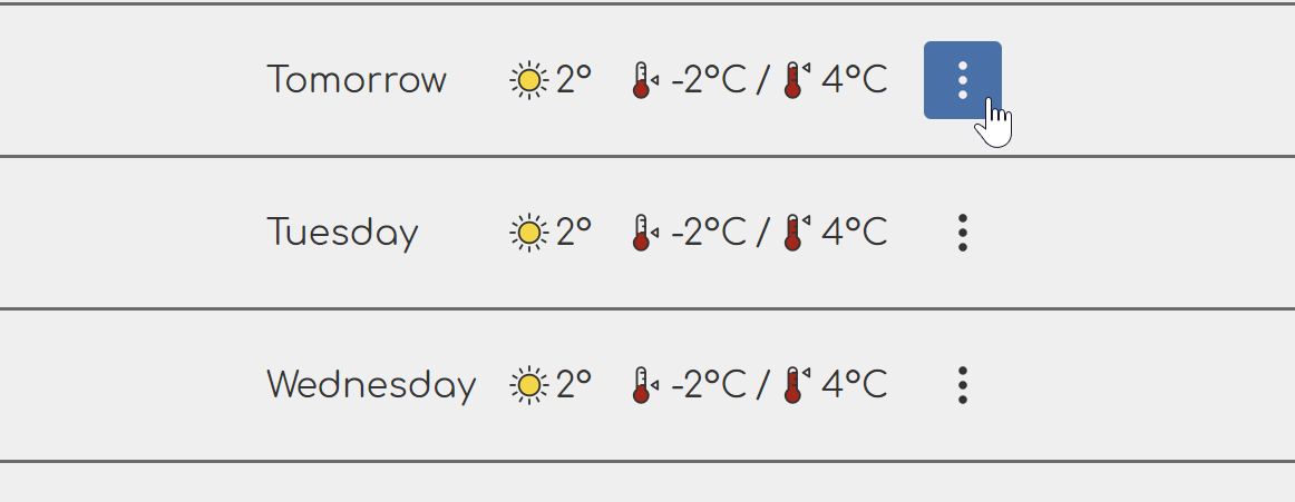
I swapped the icon to a menu icon with three dots. The end result looks like this:
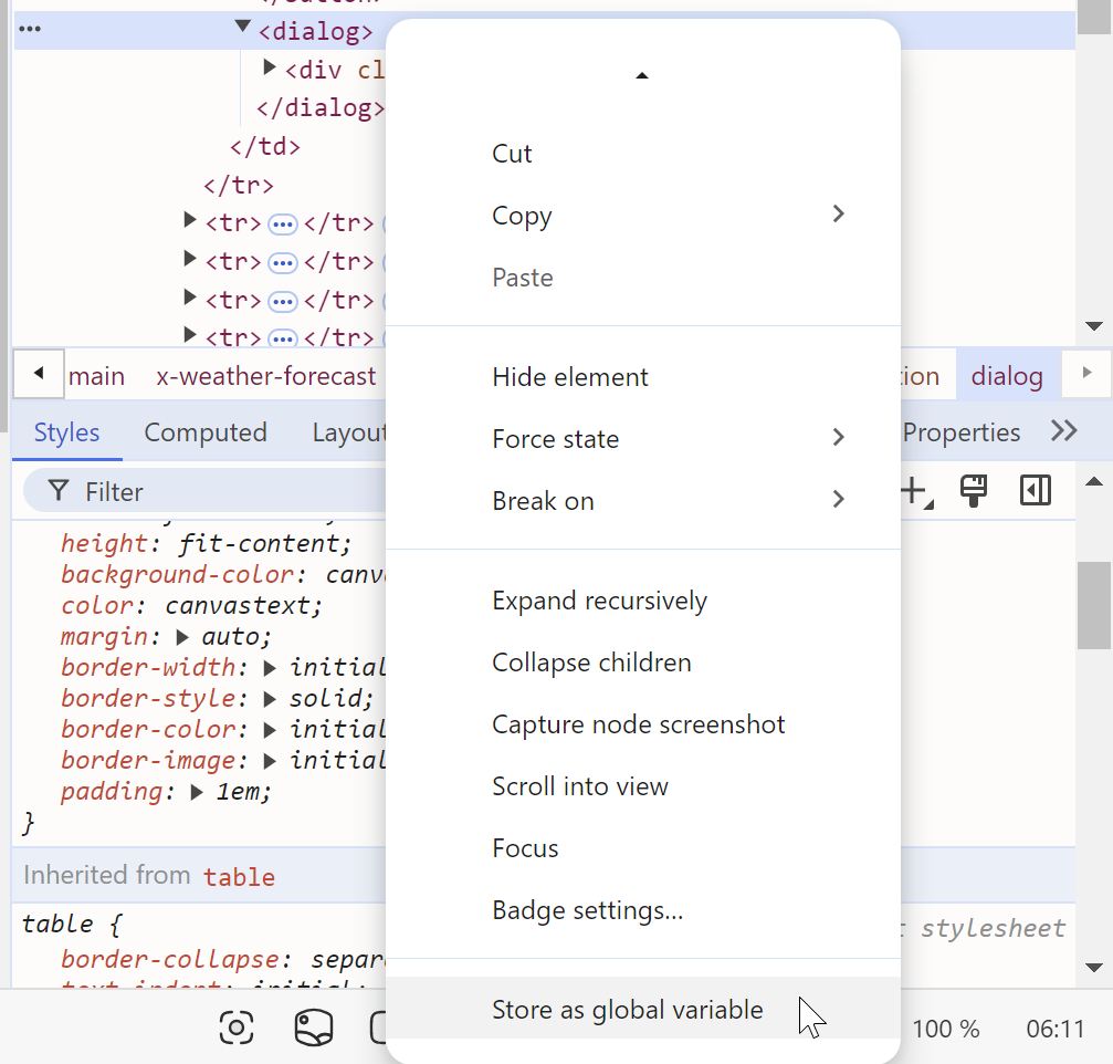
To style the dialog, I will use the dev tools to open one as a modal. I find
a <dialog> element in the dev tools, right-click it and select the "Set as
global variable" option.
Now I have a variable temp1 which I can use to refer to the dialog element.
To open it as a modal, I execute this in the console:
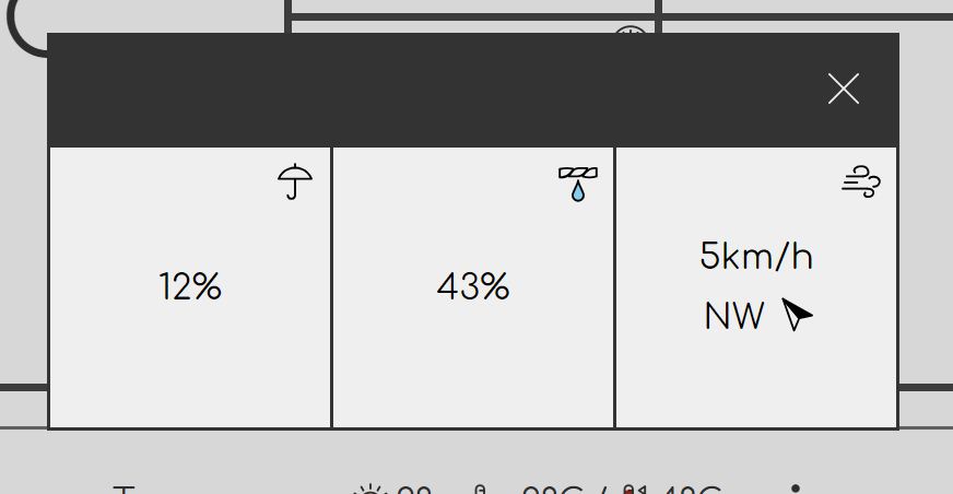
temp1.showModal()This pops up the dialog as a modal dialog:
Since it would be a nuisance to repeat this every time I change something in the code, I have two options for reloading just the CSS while keeping the dialog open. My JetBrains IDE (WebStorm is free for personal use 😉) has a developer server that will hotswap CSS when I change it. If I'm not using the JetBrains server – there are legit cases where I won't – then I can manually reload just the CSS using the aptly named Reload CSS extension (there are several other similar extensions if you don't like it, or it becomes discontinued).
I totally forgot to revisit the markup for the dialog contents. Now that I've switched the main weather summary to an icon-based display, it may make more sense to do the same for the dialog. The updated markup looks like this:
<div class="precipitation-probability">
    <dt>
        <x-icon name="precipitation"></x-icon>
        <span class="alt-text">Precipitation probability</span>
    </dt>
    <dd>12%</dd>
</div>
<div class="humidity">
    <dt>
        <x-icon name="humidity"></x-icon>
        <span class="alt-text">Humidity</span>
    </dt>
    <dd>43%</dd>
</div>
<div class="wind">
    <dt>
        <x-icon name="wind"></x-icon>
        <span class="alt-text">Wind</span>
    </dt>
    <dd>
        <span class="wind-speed">5km/h</span>
        <span class="wind-direction">
            <span>NW</span>
            <x-icon name="wind-direction" style="--direction: 320"></x-icon>
        </span>
    </dd>
</div>
The style attribute on the last <x-icon> element is for pointing the
direction arrow in the correct direction. The --direction property will be set
by the JavaScript once it's done. One thing I'd like you to see at this point is
that the property doesn't do anything on its own. It's 100% up to CSS to
determine how this property is used. It may or may not use it to rotate the
arrow, etc.
This is slightly more complex than directly adding a transform to the style
attribute, but it is more flexible because it lets the CSS decide what to do
with the property including transforming it into other values, ignoring it, etc.
In my experience, this doesn't have any particular drawback other than the
slight increase in complexity – because it's an explicit contract between
JavaScript and CSS as opposed to just a JavaScript-only solution. The loss in
flexibility form the direct JavaScript style manipulation is a bigger drawback.
Therefore I always use this method, and this has, therefore, become the only
valid use case for the style property.
In the previous part, I forgot to add this property to the summary section, so I'm also going to fix that now, too.
Going back to the styling, the first thing I need to do is address the reset
for the dialog. I'm going to remove the default border and padding, so I'm
adding this to the common.css:
dialog {
    padding: 0;
    border: 0;
}
I'm also going to (separately) set the default background color for the dialog:
dialog {
    background: var(--background-color);
}
The reason for doing this separately is because this is a project-specific style, not part of the reset. I like to keep these separate because I tend to copy the reset between projects, and I don't want to have to clean up project-specific bits.
While I'm at this, I'm going to also add the default dialog header style:
.dialog-header {
    display: flex;
    justify-content: space-between;
    align-items: center;
    padding: 0.5em;
    color: var(--background-color);
    background: var(--secondary-background-color);
}
Now I can add the page-specific styles to index.css to finish off the
dialog styling.
The dialog header styling foresees a title and a close button being at the
opposite ends of the header. In the case of the additional info dialog, the
title is hidden as .alt-text, so I have to adjust the header style:
x-weather-forecast .dialog-header {
    justify-content: flex-end;
}
The close button is already styled the same way as the menu button in the table
because I used a selector with a broader scope. This actually works fine. Even
though the header uses inverted colors, the button label has the correct color
because I used color: inherit.
I could have given the button a specific color like var(--text-color), but in
a way, color: inherit is closer to what I intend to. I just want to say "Use
the same color as the surrounding text." I sometimes forget about this nuance
myself, but it's good to try to keep in mind. Usually, going for the
semantically correct version – the one that is closer to the semantics of our
intent – yields better results.
The rest is styled as follows:
x-weather-forecast .dialog-content dl {
    display: flex;
    padding: 0.1em;
    gap: 0.1em;
    background: var(--text-color);
}

x-weather-forecast .dialog-content dl > div {
    position: relative;
    display: flex;
    justify-content: center;
    align-items: center;
    width: 8em;
    height: 8em;
    background: var(--background-color);
}

x-weather-forecast .dialog-content dt {
    position: absolute;
    top: 0;
    right: 0;
    display: flex;
    justify-content: center;
    align-items: center;
    width: 2em;
    height: 2em;
}
The last bit is very similar to what I did before with the icon in the corner.
It's actually a better version of what I had in the summary because it's also
semantically more correct – the icon that represents the type of the value is a
name (<dt>), not part of the value (<dd>).
As with the summary, I want the wind section to be laid out vertically and then I will also add the styling for the wind direction.
x-weather-forecast .wind dd {
    display: flex;
    flex-direction: column;
    justify-content: center;
    align-items: center;
    gap: 0.5em;
}

x-weather-forecast .wind-direction x-icon {
    transform: rotate(calc(1deg * var(--direction)));
}
I know some of that code is duplicated, but I'll refactor it later. I already know I'm going to need to refactor the summary section as well, and unify the styling anyway.
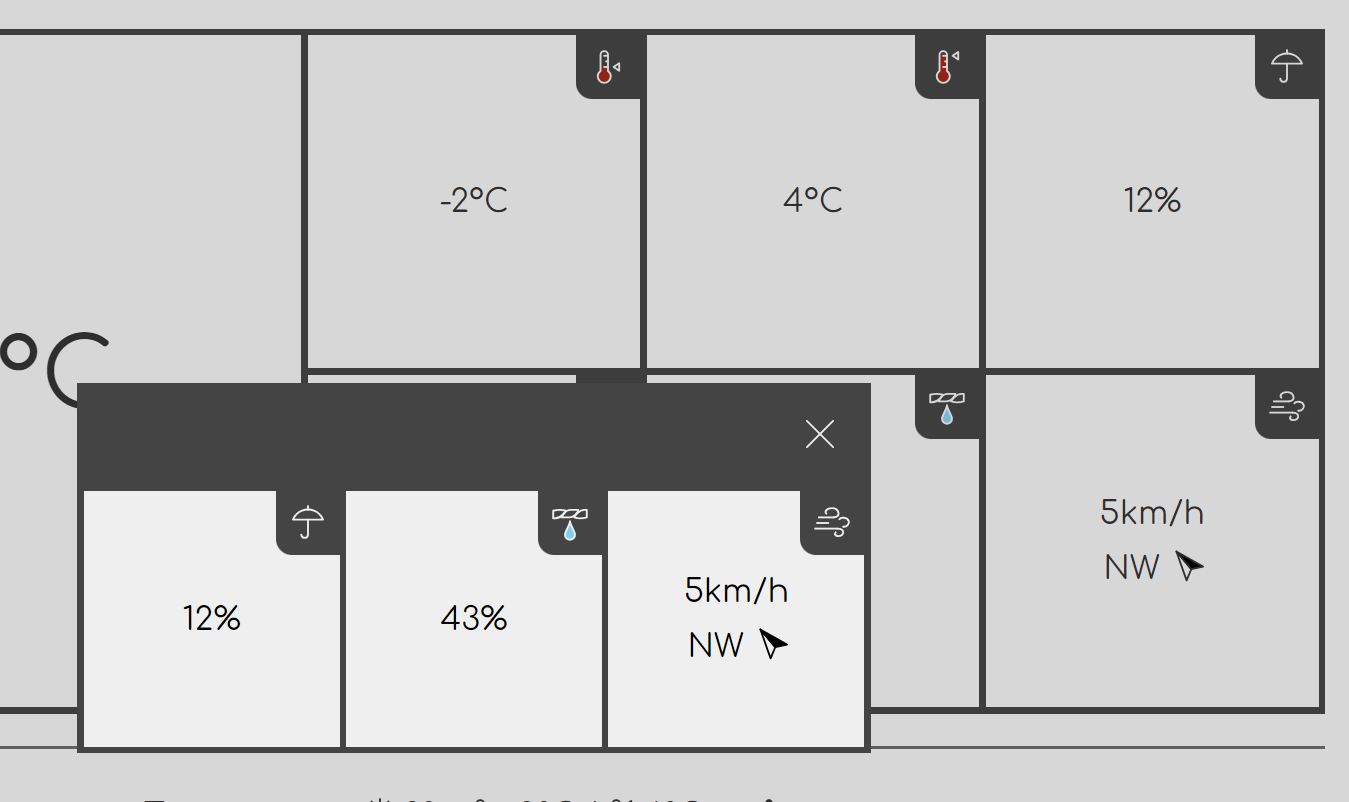
The final dialog looks like this:
Fixing the summary
I need to go back to the summary to fix a few things.
- Improve the content structure to be semantically more correct.
- Unify the styling for the tiles in the dialog and the tiles in the summary.
- Add the
--directionproperty to wind direction.
Currently, the tiles in the summary section have the following general format:
<div class="max-temperature">
    <dt class="alt-text">Maximum temperature</dt>
    <dd>
        <x-icon name="temp-max"></x-icon>
        <span>4°C</span>
    </dd>
</div>
What I want is to wrap the <dt> text in a <span> and mark that as
.alt-text instead of hte whole <dt>, and then move the <x-icon> element
into the <dt>. The first reason for that is, as I mentioned before, semantics.
The second reason is, I avoid the situation where I have two <x-icon>
elements in the same <dd> element, necessitating more complex selectors to
differentiate them. And lastly, by having a <dt> around the icon, I can also
add more styling that would improve the appearance. I also unwrapped all values
in the <dd> elements that had a <span> around them. They don't need any
wrappers.
The final result looks like this:
<div class="max-temperature">
    <dt>
        <x-icon name="temp-max"></x-icon>
        <span class="alt-text">Maximum temperature</span>
    </dt>
    <dd>
        4°C
    </dd>
</div>
Although the existing stylesheet still works, I will need to refactor the stylesheet to unify the styling of the summary and additional info tiles.
Firstly, I'm giving the two <dl> elements (one in the summary, one in the
dialog) a class .weather-tiles. I then use that to refer to them in the CSS.
.weather-tiles {
    --tile-border: 0.2em;

    gap: var(--tile-border);
    padding: var(--tile-border);

    background: var(--secondary-background-color);
}

.weather-tiles > div {
    position: relative;
    display: flex;
    align-items: center;
    justify-content: center;
    aspect-ratio: 1;

    background: var(--background-color);
}

.weather-tiles dt {
    position: absolute;
    top: 0;
    right: 0;
    display: flex;
    justify-content: center;
    align-items: center;
    width: 2em;
    height: 2em;
    border-bottom-left-radius: 0.5em;
    background: var(--secondary-background-color);
    color: var(--background-color);
}

.weather-tiles .wind dd {
    display: flex;
    flex-direction: column;
    justify-content: center;
    align-items: center;
    gap: 0.5em;
}
Effectively, the .weather-tiles class is a CSS component. (Yes, components
don't need to include JavaScript and/or HTML. You have Bootstrap as one of
the pioneers of this approach.)
The interface of a component consists of the various assumptions it makes about the subtree of the element to which it is applied. For example:
.weather-tiles .wind ddThis is a selector that assumes .weather-tiles will contain a .wind
element (somewhere) and then a dd element (somewhere) inside it.
These assumptions can be rigid (specific) or flexible (general). The selector I gave as an example earlier has a lot of "somewhere inside", which is what the descendant combinator means. On the other hand, this combinator is more rigid:
.weather-tiles > divThis is a child combinator, which requires that the <div> is a direct child of
.weather-tiles. (As a mental exercise, I could loosen the rigidity by adding a
class to each <div> and selecting the class using a descendant combinator.
I'm not gonna bother with that now.)
The rigidity of those assumptions define the rigidity of the interface. Therefore, I generally want to make my assumptions more general when I can get away with it. I prefer to leave myself some wiggle room in case I end up needing to change something.
If you have more specific assumptions encoded in the selectors, you will probably have more clarity about what the expected structure is gonna be. For example, you might be able to read the selectors and figure out exactly where each element should be placed. This is especially true if you're using nesting to mirror the HTML structure. However, I don't think this is a good trade-off for two reasons:
- CSS should not dictate the structure to begin with, it should be the other way around.
- The loss of flexibility can come and bite me in the ass later when I need to change something and end up having to do it in two places instead of just one.
I'm also adding the support for the --direction property:
.weather-tiles .wind-direction x-icon {
    transform: rotate(calc(1deg * var(--direction)));
}
The rest of it is a matter of cleaning up the code to remove the stuff that
were abstracted into the new .weather-tiles component.
I flipped the background on the icons to add a bit of visual interest.
Conclusion
In this part, I've finished the styling (for now) of the weather information page.
The next part would normally be about the JavaScript parts of this page, but there's a number of people who wonder how vanilla apps scale, so in the next part, I'm going to go pretend this is a huge-ass project requiring a team, and provide hooks for allowing multiple developers to work on the same page.