Visualization using vanilla SVG (part 2)
Continuing from where I left off in the previous part, in this part I'm going to dress up the charts so they look the part. This means adding the axis lines, axis labels, and grid lines.
Quality-of-life fixes
As I was looking for a convenient spot to start adding these features, I
noticed that the drawChart() function is now rather big, and contains lots
of variable declarations. To prevent confusion about where these are used,
I've decided to add internal blocks to mark the scope where they are going
to be used.
To give you a sense of what I'm talking about consider this code:
drawChart = svg => {
    let extent = svg.extent,
        timeSeriesList = svg.timeSeries

    // Reset viewBox
    let parentWidth = this.offsetWidth
    svg.setAttribute('viewBox', `0 0 ${parentWidth} ${parentWidth / 2}`)

    // ....
}
The variable parentWidth can be used anywhere below the declaration. Now, from
the formatting, we may get the (correct) idea that it's probably only used in
the 'Reset viewBox' section as I make sure I use multiple declaration syntax to
group declarations together, and the parentWidth is in a separate group, etc.
But then I might have accidentally used it elsewhere and forgot about it. It
happens. I can verify this by searching for usages (a quick Ctrl+click in my
IDE), but that's one more thing I need to remember to do.
The best way to do this, imo, is to make it clearer that this variable isn't used elsewhere, and that's achieved using blocks in JavaScript.
let /* .... */
    drawChart = svg => {
        let extent = svg.extent,
            timeSeriesList = svg.timeSeries

        { // Reset viewBox
            let parentWidth = this.offsetWidth
            svg.setAttribute('viewBox', `0 0 ${parentWidth} ${parentWidth / 2}`)
        }

        // ....
    }
With this change, I now know 100% that the parentWidth variable is only
used within the enclosing block.
Blocks in JavaScript are just a pair of curly braces. It's the same stuff
you normally use with if, for, while, and similar statements. What
makes blocks interesting for me is that they can be used to reduce the scope
of a variable without wrapping code in a function.
Axis lines
The lines that represent the x and y axis can be drawn as a single path.
They are the same in every chart, so I can patch it into the drawChart()
function.
let /* .... */
    drawChart = svg => {
        // ....

        { // Draw axis lines

        }

        // ....
    }
The first thing first, I'm extracting the plot width and height values from the code related to plotting the time series:
let /* ... */
    drawChart = svg => {
        // ....

        { // Reset viewBox
            // ....
        }

        let plotWidth = svg.viewBox.baseVal.width - paddingLeft - paddingRight,
            plotHeight = svg.viewBox.baseVal.height - paddingTop - paddingBottom

        { // Draw axis lines

        }

        // ....
    }
These variables are declared outside blocks because they are shared by two
blocks, including the one related to axis lines. I declare them after the 'Reset
viewBox' block because the values they calculate depends on the viewBox.
Now I can draw the axis lines.
{ // Draw the axis lines
    let path = svg.querySelector('.axes')
    if (!path) {
        path = createSVG('path')
        path.setAttribute('class', 'axes')
        svg.append(path)
    }
    path.setAttribute('d', `M${paddingLeft},${paddingTop} L${paddingLeft},${paddingTop + plotHeight} L${paddingLeft + plotWidth},${paddingTop + plotHeight}`)
}
I give the line a class .axes (it's not a typo, 'axes' is plural of 'axis',
as it's a Latin word). I set the path's d attribute so that it goes like this:
- (padding left, padding top)
- (padding left, padding top + plot area height)
- (padding left + plot area width, padding top + plot area height)
This gives me a single line that serves as both y-axis and x-axis.
In index.css, I will make the select for the the default styling for
<path> to include all <path> elements, not just the ones we had last time:
x-weather-forecast .chart path { /* <-- changed selector here */
    fill: none;
    stroke-linecap: round;
    stroke-width: var(--cart-stroke-width);
}
I'll also change the color of the axes line.
x-weather-forecast .chart {
    /* .... */
    --chart-aux-line-color: var(--control-color);
    /* .... */
}

x-weather-forecast .chart .axes {
    stroke: var(--chart-aux-line-color);
}
Tick marks and tick legends
The tick marks are small lines along the axes that are placed at specific intervals to help gauge the values of various points on the chart. These are usually labelled so we know exactly what they represent.
The code related to ticks and tick labels will go in a block of its own:
let /* .... */
    drawChart = svg => {
        // ....

        { // Draw tick marks and tick labels

        }

        // ....
    }
I'm first going to define some variables that will control some common rendering parameters. From my experience, I know I will want to tweak this for better visual effect.
{ // Draw tick marks and tick labels
    let tickLength = 5, // px
        tickLabelGap = 4 // px
}
I'm first implementing the vertical tick marks.
{ // Draw tick marks and tick labels
    // ...

    // Vertical ticks
    let numTickMarksVert = 5,
        numTickGapsVert = numTickMarksVert - 1,
        tickStepVert = plotHeight / numTickGapsVert,
        getTickLabelText = i => Math.round(extent.max - i * (extent.max - extent.min) / numTickGapsVert),
        ticks = svg.querySelectorAll('.tick.vertical')

    for (let i = 0; i < numTickMarksVert; i++) {
        let tickGroup = ticks[i],
            tickMark = tickGroup?.querySelector('path'),
            tickLabel = tickGroup?.querySelector('text')

        if (!tickGroup) {
            tickGroup = createSVG('g')
            tickGroup.setAttribute('class', 'tick vertical')
            tickMark = createSVG('path')
            tickLabel = createSVG('text')
            tickGroup.append(tickMark, tickLabel)
            svg.append(tickGroup)
        }

        let tickY = paddingTop + i * tickStepVert

        tickMark.setAttribute('d', `M${paddingLeft},${tickY},L${paddingLeft - tickLength},${tickY}`)
        tickLabel.textContent = getTickLabelText(i)
        tickLabel.setAttribute('x', paddingLeft - tickLength - tickLabelGap)
        tickLabel.setAttribute('y', tickY)
    }
}
The numTickMarksVert variable is used to parametrize the entire block so that
I can tweak the number of ticks shown. The numTickGapsVert is just a derived
value I assign to a variable for clarity.
tickStepVert holds the distance between adjacent tick marks.
The getTickLabelText return the tick label at a given index. The ticks are
enumerated from top to bottom, but the labels go from bottom (smallest) to top
(largest). This is why this function has to calculate the labels backwards.
The ticks holds a node list containing any existing ticks. This will be an
emtpy list when the ticks are first rendered, and will hold all previously
rendered ticks otherwise.
I'm iterating through the the ticks one by one and creating or updating them:
for (let i = 0; i < numTickMarksVert; i++) {
    // ....
}
I first attempt to pick up a matching tick from the previously selected list. If there's no matching tick, I create a new one.
let tickGroup = ticks[i],
    tickMark = tickGroup?.querySelector('path'),
    tickLabel = tickGroup?.querySelector('text')

if (!tickGroup) {
    tickGroup = createSVG('g')
    tickGroup.setAttribute('class', 'tick vertical')
    tickMark = createSVG('path')
    tickLabel = createSVG('text')
    tickGroup.append(tickMark, tickLabel)
    svg.append(tickGroup)
}
This is the same pattern as the one we had in the axis lines block, but more elaborate due to nested elements.
I will generalize this pattern to save some code:
let createSVGInside = (parentNode, tagName, className) => {
        let element = createSVG(tagName)
        if (className) element.setAttribute('class', className)
        parentNode.append(element)
        return element
    }
Note the return element as the last statement. This is important. With
this I get the following:
{ // Draw the axis lines
    let path = svg.querySelector('.axes') || createSVGInside(svg, 'path', 'axes')
    // ....
}

{ // Draw tick marks and tick labels
    // ....

    for (let i = 0; i < numTickMarksVert; i++) {
        let tickGroup = ticks[i] || createSVGInside(svg, 'g', 'tick vertical'),
            tickMark = tickGroup?.querySelector('path') || createSVGInside(tickGroup, 'path'),
            tickLabel = tickGroup?.querySelector('text') || createSVGInside(tickGroup, 'text'),
            tickY = paddingTop + i * tickStepVert

        // ....
    }
}
Lastly, I'm drawing the tick marks and tick labels:
{ // Draw tick marks and tick labels
    // ....

    for (let i = 0; i < numTickMarksVert; i++) {
        // ....

        tickMark.setAttribute('d', `M${paddingLeft},${tickY},L${paddingLeft - tickLength},${tickY}`)
        tickLabel.textContent = getTickLabelText(i)
        tickLabel.setAttribute('x', paddingLeft - tickLength - tickLabelGap)
        tickLabel.setAttribute('y', tickY)
    }
}
Note that I'm not dealing with the alignment of the text here at all. It's all done in the CSS. Speaking of which:
x-weather-forecast .chart :is(.axes, .tick path) {
    stroke: var(--chart-aux-line-color);
}

x-weather-forecast .chart .tick text {
    text-anchor: end;
    dominant-baseline: middle;
    fill: currentColor;
}
In the first declaration, I've added the the .tick path selector so it uses
the same properties as the axis lines. The second block describes the text
alignment and color. The special currentColor (or currentcolor) value is the
value of the element's or an ancestor's color attribute, wherever it is
defined. In this case, the currentColor points to the effective color
property value of the <figure> element which encloses the <svg>.
Moving on to the horizontal tick marks. These are drawn along the x-axis and represent time. I'm currently not passing the time to the chart at all, so I'll need to fix that first:
let /* .... */
    displayForecast = data => {
        // ....

        // Temperature chart
        temperatureChart.times = data.daily.time.slice(1)
        // ....

        // Precipitation chart
        precipitationChart.times = data.daily.time.slice(1)
        // ....

        // Wind chart
        windChart.times = data.daily.time.slice(1)
        //
    }
I've also used this opportunity to add .slice(1) to all time series data, as
last time I did the line chart portion, it's slipped my mind that the daily
forecast data includes today's date, but I'm only plotting the future dates.
I can now reference the times array in the drawChart() function:
let /* .... */
    drawChart = svg => {
        let /* .... */
            times = svg.times

        // ....
    }
I'm enclosing the vertical tick marks code in a block so I don't have to worry
about variable naming (e.g., ticks), and adding a new block for the horizontal
ones.
{ // Draw tick marks and tick labels
    // ....

    { // Vertical ticks
        // ....
    }

    { // Horizontal ticks

    }
}
I can now also rename variables to remove the Vert suffix, as they are now
fully encapsulated within the block.
Here's the code for the horizontal tick marks. It's very similar to the previous block, but not similar enough for me to want to abstract them (just yet).
{ // Horizontal ticks
    let numTickMarks = 10,
        numTickGaps = numTickMarks - 1,
        tickStep = plotWidth / numTickGaps,
        getTickLabelText = i => new Date(times[i]).toLocaleDateString('en-US', {day: 'numeric', month: 'numeric'}),
        ticks = svg.querySelectorAll('.tick.horizontal')

    for (let i = 0; i < numTickMarks; i++) {
        let tickGroup = ticks[i] || createSVGInside(svg, 'g', 'tick horizontal'),
            tickMark = tickGroup.querySelector('path') || createSVGInside(tickGroup, 'path'),
            tickLabel = tickGroup.querySelector('text') || createSVGInside(tickGroup, 'text'),
            tickX = paddingLeft + i * tickStep

        tickMark.setAttribute('d', `M${tickX},${paddingTop + plotHeight},L${tickX},${paddingTop + plotHeight + tickLength}`)
        tickLabel.textContent = getTickLabelText(i)
        tickLabel.setAttribute('x', tickX)
        tickLabel.setAttribute('y', paddingTop + plotHeight + tickLength + tickLabelGap)
    }
}
The CSS is more or less intact.
I'm tweaking the paddings and other parameters to get a good layout. The final values are a lot bigger than I anticipated. (Actually, I didn't quite anticipate anything. I just earmarked some values knowing I'd tweak them later.)
I've settled on the left and bottom padding of 50, and increased the right padding to 20. The top padding remains at 10.
let /* .... */
    paddingLeft = 50,
    paddingRight = 20,
    paddingTop = 10,
    paddingBottom = 50
I've also tweaked the tick label gap, increasing it to 20.
{ // Draw tick marks and tick labels
    let tickLength = 5, // px
        tickLabelGap = 20 // px

    // ....
}
Grid lines
I could technically do the grid lines as part of the tick mark block. However, grids are not necessarily coupled to tick marks. They will be in my case, but I want to keep an option open to decouple them later (e.g., denser grid compared to ticks).
I'll do the grid in a separate block.
let /* .... */
    drawChart = svg => {
        // ....

        { // Draw the grid
            let numGridLinesX = 8,
                numGridLinesY = 3

            { // Draw vertical grid lines
                let gridSpacing = plotWidth / (numGridLinesX + 1),
                    y1 = paddingTop,
                    y2 = paddingTop + plotHeight,
                    gridLines = svg.querySelectorAll('.grid-line.vertical')

                for (let i = 0; i < numGridLinesX; i++) {
                    let gridLine = gridLines[i] || createSVGInside(svg, 'path', 'grid-line vertical')
                    let x = paddingLeft + (i + 1) * gridSpacing
                    gridLine.setAttribute('d', `M${x},${y1} L${x},${y2}`)
                }
            }

            { // Draw horizontal grid lines
                let gridSpacing = plotHeight / (numGridLinesY + 1),
                    x1 = paddingLeft,
                    x2 = paddingLeft + plotWidth,
                    gridLines = svg.querySelectorAll('.grid-line.horizontal')

                for (let i = 0; i < numGridLinesY; i++) {
                    let gridLine = gridLines[i] || createSVGInside(svg, 'path', 'grid-line horizontal')
                    let y = paddingTop + (i + 1) * gridSpacing
                    gridLine.setAttribute('d', `M${x1},${y} L${x2},${y}`)
                }
            }
        }

        // ....
    }
The two code blocks – one for the vertical grid lines and one for the horizontal ones – should be quite straightforward.
I specify the number of grid lines using the numGridLinesX and numGridLinesY
variables. this is different from the number of data points in each axes because
we don't draw the first and last lines (the first one is the axis line, the last
line is redundant as it is edge of the chart). I then calculate the grid line
spacing, the common coordinates shared by all grid lines, and, as before, I
query the existing grid lines to cover the redraw scenario. Drawing the lines is
a straightforward affair, similar to the tick marks.
I'm updating the CSS to take into account the grid lines. For this I first want to define a color for the grid lines. They are not essential, so I don't want them too strong.
@property --chart-grid-line-color {
syntax: "<color>";
inherits: true;
initial-value: #fff;
}
x-weather-forecast .chart {
/* .... */
--chart-grid-line-color: #555;
/* .... */
transition-property:
/* .... */
--chart-grid-line-color;
/* .... */
}
@media (prefers-color-scheme: light) {
x-weather-forecast .chart {
/* .... */
--chart-grid-line-color: #999;
}
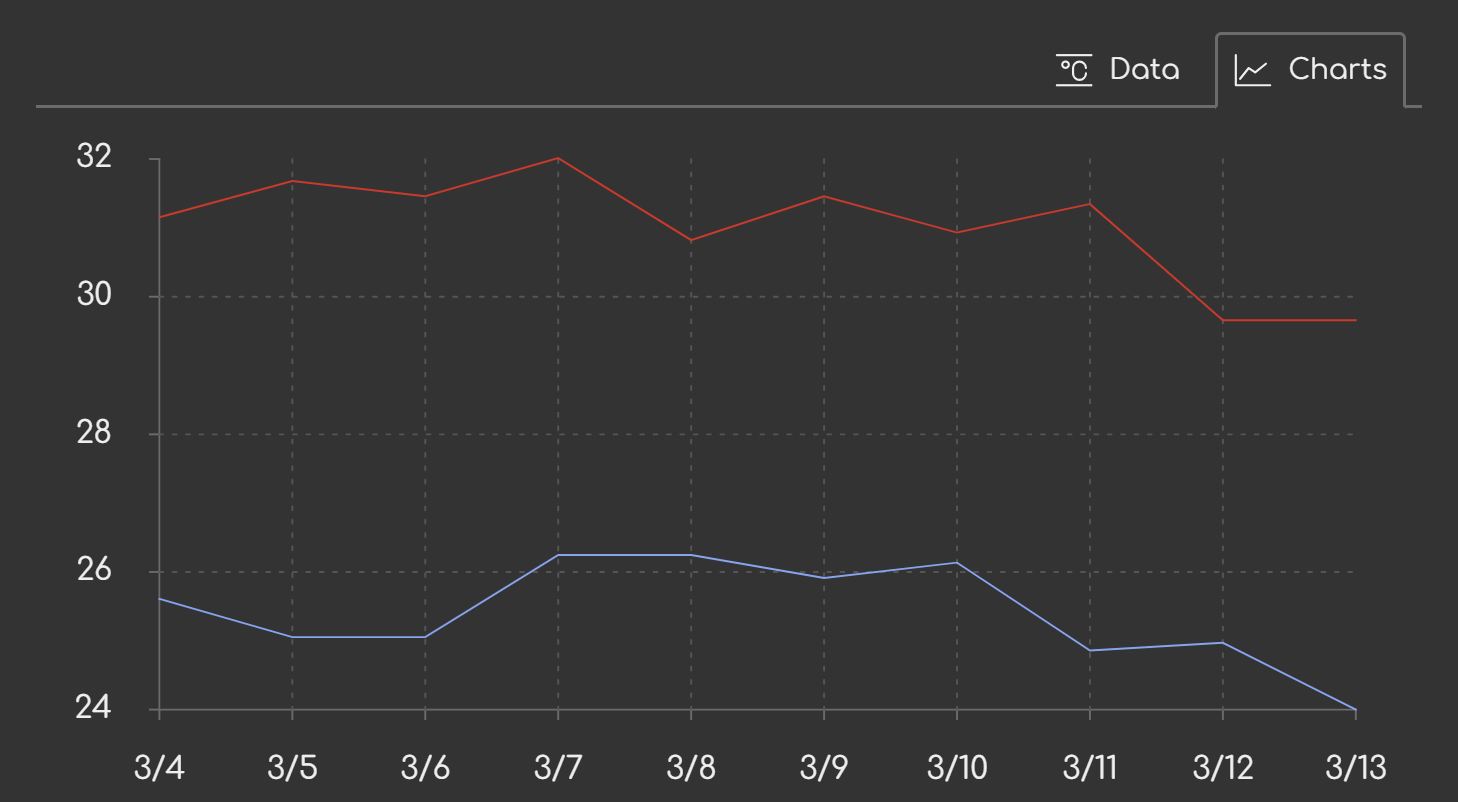
}Here's what the result looks like:
Refactoring the grid lines code?
I've noticed that some developers struggle with factoring code. This section is dedicated them them. If you don't have issues with factoring, you may skip this part. 😉
Factoring struggles can be caused by the lack in some of the following skills:
- Linguistic ability – Struggling to find words to express concepts. (Read more books!)
- Pattern recognition - Difficulty spotting similarities and differences in code is. (Read lots of code).
- Abstract thinking - Lack of understanding that different concept exist at different levels of abstraction. (Practice how to identify the level of abstraction.)
- Imagination - The ability to picture the effect before making a change. (This improves with experience, so keep experimenting!)
There are more, of course, but I think these are the common ones. Luckily, all of them can be evolved through practice.
Factoring is mainly done for three reasons:
- Increase clarity – Extracting units makes code easier to follow and can reveal hidden relationships, if done well.
- Facilitate reuse – Reduce duplication by placing logic in a more accessible location (e.g., a shared module).
- Enforce single source of truth - Ensure logic is defined in one place, making changes more reliable.
Deduplication is secondary. Not all deduplication leads to successful factoring – sometimes it leads to premature abstraction or unnecessary complexity.
I see two code blocks that look virtually identical, and I'm itching to refactor – not really, but let's imagine I am for dramatic effect 🤫. It's a perfect opportunity to discuss factoring (a subset of refactoring).
I'll start by identifying the truths expressed in the code for the vertical grid:
- Grid spacing is calculated by dividing the plot area width by the number of vertical grid lines plus 1.
- The y1 coordinate of all grid lines is the top padding
- The y2 coordinate of all grid lines is the the sum of the top padding and the plot area height
- The existing grid lines are selected using
.grid-line.verticalselector - A vertical grid line is either one of the pre-existing grid lines or a grid
line created with a
grid-line verticalclass. - The x coordinate is a sum of the left padding, the index of the grid line plus one multiplied by the grid spacing.
- The line is drawn from (x,y1) to (x,y2).
Next, I'll list the truths about the horizontal grid lines:
- Grid spacing is calculated by dividing the plot area height by the number of horizontal grid lines plus 1.
- The x1 coordinate of all grid lines is the left padding
- The x2 coordinate of all grid lines is the the sum of the left padding and the plot area width
- The existing grid lines are selected using
.grid-line.horizontalselector - A horizontal grid line is either one of the pre-existing grid lines or a grid
line created with a
grid-line horizontalclass. - The y coordinate is a sum of the top padding, the index of the grid line plus one multiplied by the grid spacing.
- The line is drawn from (x1,y) to (x2,y).
The lists are symmetrical, meaning each point has a direct counterpart in the other list. This suggests that the blocks express the same underlying truths. Successfully creating a good abstraction depends on how these items overlap. The goal is to generalize the items them into a common concept. The more convoluted the generalization, the more complex the abstraction.
I'll try to generalize each set of points now, and emphasize the variables they rely on.
- Grid spacing is calculated by dividing the dimension of the plot area along the cross-axis by the number of grid lines plus 1.
- The first main-axis coordinate (m1) is equal to the near main-axis padding.
- The second main-axis coordinate (m2) is equal to the sum of the near main-axis padding and dimension of the plot along the main axis.
- The existing grid lines are selected using a combination of
.grid-linesand an axis-specific selector. - A grid line is either one of the pre-existing grid lines or a grid line
created with a
grid-lineand an axis-specific class. - The cross-axis coordinate (n) is a sum of the near cross-axis padding and a multiple of the line index plus one and grid spacing.
- The line is drawn from (x1,y1) to (x2,y2).
Let me list the parameters:
- number of grid lines
- dimension of the plot area along the main axis
- dimension of the plot area along the cross-axis
- near main-axis padding
- near cross-axis padding
- axis-specific selector
- axis-specific class
The axis-specific selector can be derived from the axis-specific class so we can omit it.
Generalizing the point number 7 is a bit trickier. One block fixes the vertical position, while the other block has the fixed horizontal position. To address this, I have a few options:
- Specify how the x1, x2, y1, and y2 coordinates are calculated.
- Specify how coordinate pairs are derived from the pre-calculated main-axis and cross-axis values.
- Specify what the
dparameter looks like by using a string-based template.
These represent three levels of abstraction, moving from the lowest (option 1) to the highest (option 3). Here's what the different options might look (they are untested, so possibly incorrect):
// Option 1:
drawGridLines({
    getX1: () => paddingLeft,
    getX2: () => paddingLeft + plotWidth,
    getY1: (i, step) => paddingTop + i * step,
    getY2: (i, step) => paddingTop + i * step,
})

// Option 2:
drawGridLines({
    // ....,
    getGridLineCoordinates: (m1, m2, c) => [[m1, c], [m2, c]],
})

// Option 3:
drawGridLines({
    gridLineTemplate: 'Mm1,c Lm2,c',
})
The first two option requires the caller to specify all four coordinates and we
specify the underlying values in the formulas. The second option has us specify
two pairs of coordinates, rather than the underlying values. The last example
specifies the grid line d parameter as static data using a template, and
the interpolation of the data is done within the drawGridLines() function.
The 'moving parts' are the functions in the first two example. The second
example specifies the grid line d parameter as static data (template).
let /* .... */
    drawGridLines = ({
             svg,
             // grid options
             numGridLines,
             gridLineClass,
             gridLineTemplate,
             // plog area options
             mainAxisPlotAreaDimension,
             crossAxisPlotAreaDimension,
             mainAxisNearPadding,
             crossAxisNearPadding,
        }) => {
        let gridSpacing = crossAxisPlotAreaDimension / (numGridLines + 1),
            gridLines = svg.querySelectorAll(`.grid-line.${gridLineClass}`),
            coordinates = {
                m1: mainAxisNearPadding,
                m2: mainAxisNearPadding + mainAxisPlotAreaDimension,
            }

        for (let i = 0; i < numGridLines; i++) {
            let gridLine = gridLines[i] || createSVGInside(svg, 'path', `grid-line ${gridLineClass}`)
            coordinates.c = crossAxisNearPadding + (i + 1) * gridSpacing
            gridLine.setAttribute('d', gridLineTemplate.replace(/(m[12]|c)/g, x => coordinates[x]))
        }
    }
This then used like so:
// Vertical grid lines
drawGridLines({
    svg,
    numGridLines: 8,
    gridLineClass: 'vertical',
    gridLineTemplate: 'Mc,m1 Lc,m2',
    mainAxisPlotAreaDimension: plotHeight,
    crossAxisPlotAreaDimension: plotWidth,
    mainAxisNearPadding: paddingTop,
    crossAxisNearPadding: paddingLeft,
})

// Horizontal grid lines
drawGridLines({
    svg,
    numGridLines: 3,
    gridLineClass: 'horizontal',
    gridLineTemplate: 'Mm1,c Lm2,c',
    mainAxisPlotAreaDimension: plotWidth,
    crossAxisPlotAreaDimension: plotHeight,
    mainAxisNearPadding: paddingLeft,
    crossAxisNearPadding: paddingTop,
})
As far as capturing all the truths we enumerated and serving as a single source for them, this abstraction works.
Here's what worked well here:
- The subtle detail of which coordinates are fixed and which are iteration-dependent is now expressed a bit more explicitly.
- The code does a good job of capturing the common characteristics of both sets of grid lines.
- It also lets us explicitly enumerate all dependencies.
What doesn't work so well:
- The grid line template fails to add clarity to the intent.
- There's a near-doubling of the lines of code (46 as opposed to 25).
Is it worth it? Well, it's a judgement call. It could go either way so it's up more esoteric factors.
I don't like near-doubling of anything. It's virtually always undesirable. One such instance, then another, then another – over a span of 1000 lines, you get another 1000 to maintain and onboard. I'd rather have half the lines of code that are somewhat harder to follow, than double the lines that are somewhat easier to follow. I know some people that can hold a lot more information in their brain at once, but I know a lot more than can't – myself included. (The difference in clarity is rarely big enough to counter this.)
Another consideration is the proximity of the two blocks and their size – technically the ability to keep them both on the screen at the same time. Since they are relatively small and next to each other, it makes spotting the commonalities and differences easier.
Because of these reasons, I'm going to abandon this particular abstraction. Instead, I'm going to let these mature a bit more, and observe them for any maintenance pain points before deciding what kind of abstraction would be worthwhile. For instance, it might end up needing a scale abstraction like the D3 has, and that changes everything about this code.
Conclusion
In this part, I've made the charts look a bit more like charts, with all the accessories you'd typically have in them. I've also given you an introduction to factoring, with an example of why I sometimes don't go ahead with it.
In the next part, I'm going to add the legend, a strip of weather condition icons along the x-axis line, and wind direction icons.
The live version is online for your viewing pleasure.